Create a Markdown Blog Using Next.js
Published Oct 25, 2021
Table of Contents
- Your Digital Garden
- List of Features
- How Does it Work
- Project Setup
- Next.js Folder Structure
- Next.js File System Based Router
- Showing Posts
- Markdown Plugins
- Markdown Component Substitution
- List Sorted Posts
- Post Categories
- Navigation
- SEO
- Styles
- Layout
- Dark Mode
- Deploy
- Conclusion
Your Digital Garden
Despite popular platforms for developers to author and share content with others you should have your own place on the internet — your own digital garden.
I set out to create something that I would use based on what I think a Markdown blog should have instead of leaving you with something barely usable. Everyone loves building Markdown blogs because it’s an excuse to learn and be creative.
If you wonder “Why not just use Gatsby?” it’s because I consider it easy but not simple like Wordpress where you don’t understand how any of it works because the abstraction is so high (I would even argue it’s more complicated to learn because how it’s tied to GraphQL).
For this reason I’m using Next.js because while you have to do more work you get to learn a lot more — in fact you’re going to be surprised how little code we’re going to write.
Understanding React is required but I’m going to try to keep it beginner friendly if you never used Next.js before and we’re going to be using TypeScript which is optional, so you can completely ignore it and just use JavaScript.
List of Features
These are the features I want from a Markdown blog that we’re going to implement:
- Dark mode
- MDX for a rich user experience
- Syntax highlight (line numbers, line highlight and copying code)
- Order posts by oldest to newest
- Filter posts by category
- Meta tags (SEO and social share images)
- Table of contents (autogenerated for us)
- GitHub Flavored Markdown to add more features
- Smart typography (real quotes and ellipses)
How Does it Work
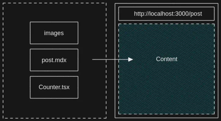
We’re going to create the URL slug from the post title such as post.mdx and have Next.js build the page for every post, so we can access it at http://localhost:3000/post.
Markdown
Markdown is popular because it’s easy to author content, so we don’t have to write HTML by hand or use a clumsy WYSWYG solution that can’t keep up with your intent.
MDX
We’re going to use MDX (JSX in Markdown) because it lets us use React components inside Markdown.
Static Generated
The site itself is static generated meaning Next.js is going to build every post in advance at build time when it deploys to Vercel meaning it’s going to be fast once it’s cached on their CDN (content delivery network). Static doesn’t mean not dynamic because we’re still using React on the page.
Styles
For the styles we’re going to use a CSS-in-JS solution styled-jsx mostly because it works out of the box with Next.js and using it is similar to a single file component if you ever used Vue or Svelte. I expect you to use your preferred styling method but if you want to stick with styled-jsx you can get styled-jsx Syntax Highlighting and styled-jsx Language Server extension for VS Code for highlighting and code completion. Nothing here is specific to CSS-in-JS other than giving us scoped styles, so feel free to use any CSS solution for React you prefer.
Deployment
For deployment we’re going to use Vercel, so whenever we push a change to GitHub it’s going to rebuild and deploy the site to Vercel.
Project Setup
Let’s initialize a Next.js project using TypeScript but feel free to exclude the --typescript flag if you don’t want to use it. Name the project whatever you want.
npx create-next-app --typescriptAfter you start the development server the page should be available at http://localhost:3000/ (read your terminal).
npm run devLet’s remove things we aren’t using:
- api folder inside pages
- Everything inside the styles folder
- Styles import in pages/_app.tsx
- Everything inside pages/index.tsx
export default function Home() {
  return <h1>Home</h1>
}
After you’re done you should see Home on your page. (You might need to manually reload the page in case HMR doesn’t work)
Let’s also set up module path aliases inside tsconfig.json, so we can import things relative to the root of our project. This lets us import a file such as '../../Component' using '@/root/components/Component' instead not having to think about where it’s located.
{
  "compilerOptions": {
  // ...
	"baseUrl": ".",
	"paths": {
      "@/root/*": ["./*"]
	}
  },
  // ...
}
You can set as many path aliases as you want such as for components, styles and whatever else you want but I prefer keeping it simple.
Next.js Folder Structure
Here is an explanation of the Next.js folder structure in your file explorer.
.next
This is the Next.js cache and build output.
pages
Next.js uses a file system based router where every file you create is a page like PHP. For example pages/about.tsx would map to http://localhost:3000/about. You can also have dynamic routes which is awesome. Next.js has special files such as _app.tsx that’s a wrapper around every page and _document.tsx to get access to the <html> and <body> tags.
api
These are your API endpoints using serverless functions meaning you don’t need to use a real server for simple things. For example you can scrape a site and serve the JSON as a response you can render in your frontend, or store it inside a database. You can’t create, or write to files since serverless functions are ephemereal and don’t have storage because they spin up once per request.
public
Holds your static assets such as images.
styles
This is where you can keep your CSS but it’s not convention.
eslintrc.json
Your ESLint linting rules.
next-env.d.ts
Makes sure Next.js types are picked up by TypeScript.
next.config.js
Let’s you extend the Webpack config for Next.js without having to eject.
tsconfig.json
TypeScript compiler options. You’re going to use jsconfig.json if you’re using JavaScript.
Some things like pages are convention in Next.js but other things like styles and where you put your components is up to you.
Next.js File System Based Router
We need a way to generate pages when we build our site.
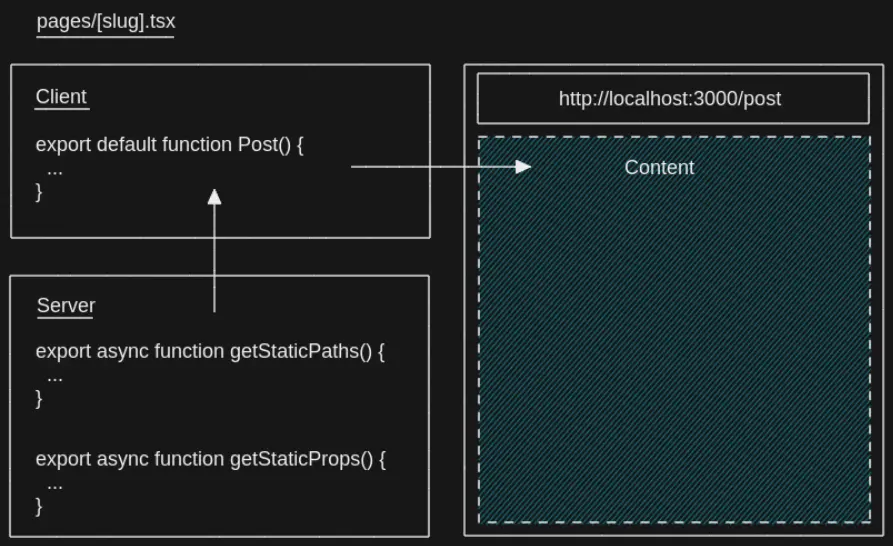
Imagine what a chore it would be if we created a new page for every post such as pages/post1.tsx, pages/post2.tsx and so on. We can instead create a dynamic route such as pages/[slug].tsx, so that we can create pages on the fly based on the posts we create.
We’re going to get those paths from the file system because we can use Node.js inside Next.js pages. This is possible because Next.js has special functions getStaticPaths and getStaticProps that we can only use inside a page, so we can pre-render the page at build time.
In the example we have [slug].tsx inside pages, so Next.js expects us to specify a slug that can be any path as the param and that’s why we created paths for http://localhost:3000/post-1 and http://localhost:3000/post-2.
This means we generate the paths and props in advance. The props are then sent to the component like regular props.
This is how a Next.js page looks like.
export default function Post(props) {
  return <h1>{props.title}</h1>
}

export async function getStaticPaths() {
  return {
    paths: [
      { params: { slug: 'post-1' } },
      { params: { slug: 'post-2' } }
	],
    fallback: false,
  }
}

export async function getStaticProps() {
  return {
    props: {
      title: 'Post',
    },
  }
}
Next.js is flexible, so we can specify per page if we want it to be SSG (server-side generated) meaning Next.js builds the pages during build time, or SSR (server-side rendered) using getServerSideProps where you have to request the page from the server.
Since this code gets executed server-side in Node.js land in some ephemeral serverless function it’s not part of the bundle.
This was just a brief introduction to Next.js but if you want to learn Next.js read the Next.js basics.
Showing Posts
Let’s start with the most interesting part which is showing Markdown posts.
For this we’re going to use mdx-bundler that’s going to help us with reading Markdown files and bundle any dependencies we have such as React components which is awesome because it’s framework agnostic unlike next-mdx-remote.
npm i mdx-bundler esbuildesbuild is just an extremely fast JavaScript bundler that mdx-bundler uses.
Let’s add some example posts by creating a posts folder at the root of our project (same place where your package.json is). Inside posts we’re going to create at least two folders with posts following this structure:
posts/post-1/post-1.mdxposts/post-2/post-2.mdx
At the top of every Markdown file we’re going to include the title, description, published, category, slug and social share image metadata that we can parse as front matter.
---
title: First Post
description: This is the first post
slug: 'post-1'
published: '2021-10-10'
category: 'javascript'
image: '/images/post-1/social-image.png'
---
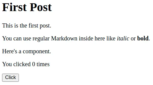
import { Counter } from './Counter'
# First Post
This is the first post.
You can use regular Markdown inside here like *italic* or **bold**.
Here's a component.
<Counter />---
title: Second Post
description: This is the second post
slug: 'post-2'
published: '2021-10-20'
category: 'javascript'
image: '/images/post-2/social-image.png'
---
# Post 2
This is the second post.
If you had an image:
If you want to use an image don’t include public in the path but just /images/post-2/image.webp because Next.js is going to serve it from http://localhost:3000/images/post-2/image.webp.
I haven’t included any social share images here but in my other post I explain how you can automate creating dynamic social share images and later I’m going to show you what <meta> tags to include. If you just want to know the dimensions it should be 1200px by 630px in size.
We’re going to include a <Counter /> component for post-1:
posts/post-1/Counter.tsx
import { useState } from 'react'

export function Counter() {
  const [count, setCount] = useState(0)

  return (
    <div>
      <p>You clicked {count} times</p>
      <button onClick={() => setCount(count + 1)}>Click</button>
    </div>
  )
}
Create [slug].tsx inside the pages directory that’s going to be responsible for our posts:
pages/[slug].tsx
We’re going to use Node.js to read from the file system and create paths based on the posts we have. First we’re going to get the post names.
import fs from 'fs'

// post paths
const currentDirectory = process.cwd()
const posts = fs.readdirSync(`${currentDirectory}/posts`)
const postPaths = posts.map((post) => post)

// [ 'post-1', 'post-2' ]
Then we’re going to map over the paths to create slugs in the format that Next.js expects.
// paths
const paths = postPaths.map((path) => ({
  params: { slug: path },
}))

/*
[
  { params: { slug: 'post-1' } },
  { params: { slug: 'post-2' } }
]
*/
At the end this is our getStaticPaths.
export async function getStaticPaths() {
  // post paths
  const currentDirectory = process.cwd()
  const posts = fs.readdirSync(`${currentDirectory}/posts`)
  const postPaths = posts.map((post) => post)

  // paths
  const paths = postPaths.map((path) => ({
    params: { slug: path },
  }))

  return {
    paths,
    fallback: false,
  }
}
The fallback: false means that it should return a 404 page if not found. If you don’t include this Next.js would complain.
When you’re using getStaticPaths you also have to use getStaticProps.
After we create the paths we can take the slug from the URL. For example when someone visits http://localhost:3000/post-1 we can find the post by post-1 and parse it using mdx-bundler.
export async function getStaticProps({ params }) {
  // slug
  const { slug } = params

  // post path
  const currentDirectory = process.cwd()
  const postPath = `${currentDirectory}/posts/${slug}/${slug}.mdx`
  const markdown = await bundleMDX({ file: postPath, ...options })
  const { code, frontmatter: metadata } = markdown

  return {
    props: {
      code,
      metadata,
    },
  }
}
getStaticProps taks a context argument from where we destructure params.
After we parse the post using bundleMDXFile we get the bundled code that we can use on the frontend to create a component using getMDXComponent.
We also have metadata from the front matter we can use for SEO later.
import { useMemo } from 'react'
import { getMDXComponent } from 'mdx-bundler/client'

interface PostProps {
  code: string
  metadata: any
}

export default function Post({ code, metadata }: PostProps) {
  // avoid recreating the component every render
  const Component = useMemo(() => getMDXComponent(code), [code])
  return <Component />
}
If you navigate to http://localhost:3000/post-1 you should see the post.
This took barely any code and we have a working blog that we understand how it works. If you need to catch up this is how [slug].tsx should look like.
import { useMemo } from 'react'
import { bundleMDXFile } from 'mdx-bundler'
import { getMDXComponent } from 'mdx-bundler/client'
import fs from 'fs'

interface PostProps {
  code: string
  metadata: any
}

interface Params {
  params: {
    slug: string
  }
}

export default function Post({ code, metadata }: PostProps) {
  // avoid recreating the component every render
  const Component = useMemo(() => getMDXComponent(code), [code])
  return <Component />
}

export async function getStaticPaths() {
  // post paths
  const currentDirectory = process.cwd()
  const posts = fs.readdirSync(`${currentDirectory}/posts`)
  const postPaths = posts.map((post) => post)

  // paths
  const paths = postPaths.map((path) => ({
    params: { slug: path },
  }))

  return {
    paths,
    fallback: false,
  }
}

export async function getStaticProps({ params }: Params) {
  // slug
  const { slug } = params

  // post path
  const currentDirectory = process.cwd()
  const postPath = `${currentDirectory}/posts/${slug}/${slug}.mdx`
  const markdown = await bundleMDX({ file: postPath, ...options })
  const { code, frontmatter: metadata } = markdown

  return {
    props: {
      code,
      metadata,
    },
  }
}
I urge you to console.log everything to see how it works — keep in mind logs inside special Next.js functions only show inside your terminal because it happens on the server (I still fall for that one).
Markdown Plugins
There are remark plugins that process Markdown and rehype plugins that process HTML after it’s converted from Markdown. You can use both, so you don’t have to know the difference.
If a plugin doesn’t work you’re out of luck unless there’s another one because we’re using xdm that’s a more modern Markdown compiler. For our purposes we’re going to get a bunch of plugins like rehype-prism-plus that uses Prism for syntax highlighting.
If you want to see what the plugins do head over to the features page of the finished project.
npm i rehype-code-titles rehype-image-placeholder rehype-prism-plus remark-gfm remark-autolink-headings remark-slug @silvenon/remark-smartypants remark-toc remark-unwrap-imagesInside [slug].tsx in getStaticProps we can pass a second options parameter to bundleMDXFile.
import { BundleMDXOptions } from 'mdx-bundler/dist/types'
import type {ProcessorOptions} from '@mdx-js/esbuild/lib'

// mdx plugins
import rehypeCodeTitles from 'rehype-code-titles'
import rehypeImagePlaceholder from 'rehype-image-placeholder'
import rehypePrism from 'rehype-prism-plus'
import remarkGfm from 'remark-gfm'
import remarkHeadings from 'remark-autolink-headings'
import remarkSlug from 'remark-slug'
import remarkSmartypants from '@silvenon/remark-smartypants'
import remarkTableofContents from 'remark-toc'
import remarkUnwrapImages from 'remark-unwrap-images'

export async function getStaticProps({ params }: Params) {
  // slug
  const { slug } = params

  // markdown plugins
  const options = {
    mdxOptions(options: ProcessorOptions) {
      options.remarkPlugins = [
        ...(options.remarkPlugins ?? []),
        // github flavored markdown
        remarkGfm,
        // add id to headings
        remarkHeadings,
        // add links to headings
        remarkSlug,
        // smart typographic punctuation like real quotes
        remarkSmartypants,
        // generates table of contents from headings
        // `tight` removes <p> from <li> when nested
        [remarkTableofContents, { tight: true }],
        // remove paragraph around images
        remarkUnwrapImages,
      ]
      options.rehypePlugins = [
        ...(options.rehypePlugins ?? []),
        // title for code blocks (has to come before `rehypePrism`)
        rehypeCodeTitles,
        // syntax highlight
        rehypePrism,
        // image dimensions and placeholder
        [rehypeImagePlaceholder, { dir: 'public' }],
      ]
      return options
    },
  }

  // post path
  const currentDirectory = process.cwd()
  const postPath = `${currentDirectory}/posts/${slug}/${slug}.mdx`
  const markdown = await bundleMDX({ file: postPath, ...options })
  const { code, frontmatter: metadata } = markdown

  return {
    props: {
      code,
      metadata,
    },
  }
}
Since some of the plugins don’t have types we have to apease TypeScript by creating types/global.d.ts and say they exist.
declare module '@silvenon/remark-smartypants'
declare module 'rehype-image-placeholder'
While we’re here, let’s create types/post.ts and use that type instead of any for PostProps.
export interface Post {
  category: string
  description: string
  image: string
  published: number
  slug: string
  title: string
}// rename it to avoid name collision
import { Post as Metadata } from '@/root/types/post'
interface PostProps {
code: string
metadata: Metadata
}Markdown Component Substitution
We can replace any Markdown component we want using our own React components.
For example we can replace the regular <img> component with our own that uses next/image which is awesome because it serves images for us based on the size of the device and only loads the image when it’s in view using lazy loading.
// image component
function Image(props) {
  // ...
}

// MDX components
const mdxComponents = {
  // using a component
  img: Image,
  // directly passing props
  img: (props) => <Image {...props} />
}

// inside [slug].tsx
function Post() {
  return <Component components={mdxComponents} />
}
Let’s use that to implement our <Image /> and <CodeBlock /> component, so we can get the code from the <pre> content and copy it to the clipboard. First create components at the root and mdx folder inside with Image.tsx:
components/mdx/Image.tsx
import { useState } from 'react'
import NextImage from 'next/image'

interface ImageProps {
  src: string
  alt: string
  width: string
  height: string
  blurDataURL: string
}

export default function Image({
  src,
  alt,
  width,
  height,
  blurDataURL,
}: ImageProps) {
  const [loaded, setLoaded] = useState<boolean>(false)
  const zoom = loaded ? 'zoom' : ''

  return (
    <div className="container">
      <div className={zoom}>
        <NextImage
          onLoadingComplete={() => setLoaded(true)}
          src={src}
          alt={alt}
          width={width}
          height={height}
          loading="lazy"
          placeholder={blurDataURL ? 'blur' : undefined}
          blurDataURL={blurDataURL}
        />
      </div>

      <style jsx>
        {`
          .container {
            overflow: hidden;
          }

          .zoom {
            animation: zoom 0.3s linear;
          }

          @keyframes zoom {
            from {
              transform: scale(1.1);
            }
          }
        `}
      </style>
    </div>
  )
}
We’re just passing basic src and alt image props alongside additional props we get from using the image plugin that gives us the width and height with the blurDataURL for the placeholder. After that we’re just doing a simple zoom effect like you see on some sites when the image is loaded and next/image takes care of everything else.
If this is the first time you’re seeing styled-jsx the only thing you have to know is that the styles only apply to the single component but you can also specify a global attribute.
Let’s create CodeBlock.tsx:
components/mdx/CodeBlock.tsx
import { useRef } from 'react'

interface CodeBlockProps {
  children: React.ReactNode
}

export default function CodeBlock({ children }: CodeBlockProps) {
  const preRef = useRef<HTMLPreElement>(null)

  function copy() {
    const content = preRef.current?.textContent ?? ''
    navigator.clipboard.writeText(content)
  }

  return (
    <div className="code-block">
      <pre ref={preRef}>{children}</pre>
      <button onClick={copy} className="copy">
        <span className="sr-only">Copy</span>
        <span>📋</span>
      </button>

      <style jsx>
        {`
          .code-block {
            position: relative;
          }

          .copy {
            cursor: pointer;
            position: absolute;
            top: -34px;
            right: 20px;
            font-size: 1rem;
            background: none;
            border-radius: var(--border-base);
            border: none;
            transition: transform 0.1s ease;
          }

          .copy:active {
            transform: scale(0.9);
          }
        `}
      </style>
    </div>
  )
}
We’re using a ref to get the contents of the <pre> element and copy the contents to the clipboard using the Clipboard API.
Create MDXComponents.tsx where we can export the components:
components/mdx/MDXComponents.tsx
import CodeBlock from './CodeBlock'
import Image from './Image'

const mdxComponents = {
  img: Image,
  pre: CodeBlock,
}

export default mdxComponents
I also like to create a index.ts to export everything, so we can import doing components/mdx instead of components/mdx/mdxComponents:
components/mdx/index.ts
export { default } from './MDXComponents'Import mdxComponents in [slug].tsx and pass it to Component using the components prop.
// ...
import mdxComponents from '@/root/components/mdx'

// ...
<Component components={mdxComponents as any} />
List Sorted Posts
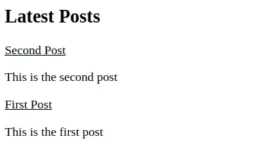
Going back to our home page inside index.ts we’re going to list the posts from oldest to newest.
We get the paths again but this time we’re only interested in the front matter so we can use the metadata to render the cards. We’re also going to turn the date into a timestamp, so we can sort it.
import { bundleMDXFile } from 'mdx-bundler'
import fs from 'fs'

import { Post } from '@/root/types/post'
import Posts from '@/root/components/Posts'

interface HomeProps {
  posts: Post[]
}

export default function Home({ posts }: HomeProps) {
  return (
    <div>
      <h2>Latest Posts</h2>
      <Posts posts={posts} />
    </div>
  )
}

export async function getStaticProps() {
  // post paths
  const currentDirectory = process.cwd()
  const posts = fs.readdirSync(`${currentDirectory}/posts`)

  // metadata from frontmatter
  const postsMetadata = []

  for (let post of posts) {
    const postPath = `${currentDirectory}/posts/${post}/${post}.mdx`
    const markdown = await bundleMDX({ file: postPath })
    const { frontmatter } = markdown

    const timestamp = new Date(frontmatter.published).valueOf()
    frontmatter.published = timestamp

    postsMetadata.push(frontmatter)
  }

  // sort posts by oldest to newest
  const sortedPosts = postsMetadata.sort(
    (firstEl, secondEl) => secondEl.published - firstEl.published
  )

  return {
    props: {
      posts: sortedPosts,
    },
  }
}
We also have to create the <Posts /> component that just renders the posts:
components/Posts.tsx
import Link from 'next/link'

import { Post } from '@/root/types/post'

interface PostsProps {
  posts: Post[]
}

export default function Posts({ posts }: PostsProps) {
  return (
    <section>
      {posts.map(({ title, description, slug }) => (
        <article key={slug}>
          <Link href={`/${slug}`}>
            <a>{title}</a>
          </Link>
          <p>{description}</p>
        </article>
      ))}

      <style jsx>
        {`
          section {
            display: flex;
            flex-direction: column;
            gap: var(--spacing-1);
          }

          article {
            padding: var(--spacing-1);
            background-color: var(--color-post);
            border-radius: var(--radius-base);
          }

          a {
            font-size: var(--font-tertiary);
            color: var(--color-post-title);
          }

          p {
            color: var(--color-post-description);
          }
        `}
      </style>
    </section>
  )
}
Now if you navigate to http://localhost:3000/ you can see the sorted posts.
Post Categories
At some point we’re going to have a couple of posts, so it would be nice being able to filter them by category.
For example when a user visits http://localhost:3000/category/javascript it should only show JavaScript posts. To create such a path we can create a category folder inside pages with [category].tsx inside:
pages/category/[category].tsx
To achieve this we’re going to use the category field from the post front matter and filter the posts based on it. We’re going to keep a list of categories to create paths from.
const categories = ['html', 'css', 'javascript'] as constexport async function getStaticPaths() {
// paths
const paths = categories.map((category) => ({
params: { category },
}))
/*
[
{ params: { category: 'html' } },
{ params: { category: 'css' } },
{ params: { category: 'javascript' } }
]
*/
return {
paths,
fallback: false,
}
}We’re also going to map the names to something more readable when rendering it.
const categoryName = {
  html: 'HTML',
  css: 'CSS',
  javascript: 'JavaScript',
}
We’re going to get the category from the URL from context.params inside getStaticProps.
We need to get the paths to the posts because we have to read them and get the front matter. If the frontmatter.category matches category from the URL we know to filter those posts and sort them.
export async function getStaticProps(context: Context) {
  const { category } = context.params

  // get the post paths
  const currentDirectory = process.cwd()
  const postFoldersPath = `${currentDirectory}/posts`
  const postFolders = readdirSync(postFoldersPath)
  const postPaths = postFolders.map(
    (folder) => `${currentDirectory}/posts/${folder}/${folder}.mdx`
  )

  // get the posts
  const posts = []

  for (let path of postPaths) {
    const markdown = await bundleMDX({ file: path })
    const { frontmatter } = markdown

    if (frontmatter.category === category) {
      posts.push(frontmatter)
    }
  }

  // sort posts by oldest to newest
  const sortedPosts = posts.sort(
    (firstEl, secondEl) => secondEl.published - firstEl.published
  )

  return {
    props: {
      posts: sortedPosts,
      category,
    },
  }
}
If you need to catch up this is [category].tsx.
import { bundleMDXFile } from 'mdx-bundler'
import { readdirSync } from 'fs'

import { Post } from '@/root/types/post'
import Posts from '@/root/components/Posts'

interface CategoryProps {
  posts: Post[]
  category: typeof categories[number]
}

interface Context {
  params: {
    category: string
  }
}

const categories = ['html', 'css', 'javascript'] as const

const categoryName = {
  html: 'HTML',
  css: 'CSS',
  javascript: 'JavaScript',
}

export default function Category({ posts, category }: CategoryProps) {
  return (
    <div>
      <h2>{categoryName[category]}</h2>
      <Posts posts={posts} />
    </div>
  )
}

export async function getStaticPaths() {
  // paths
  const paths = categories.map((category) => ({
    params: { category },
  }))

  return {
    paths,
    fallback: false,
  }
}

export async function getStaticProps(context: Context) {
  const { category } = context.params

  // get the post paths
  const currentDirectory = process.cwd()
  const postFoldersPath = `${currentDirectory}/posts`
  const postFolders = readdirSync(postFoldersPath)
  const postPaths = postFolders.map(
    (folder) => `${currentDirectory}/posts/${folder}/${folder}.mdx`
  )

  // get the posts
  const posts = []

  for (let path of postPaths) {
    const markdown = await bundleMDX({ file: path })
    const { frontmatter } = markdown

    if (frontmatter.category === category) {
      posts.push(frontmatter)
    }
  }

  // sort posts by oldest to newest
  const sortedPosts = posts.sort(
    (firstEl, secondEl) => secondEl.published - firstEl.published
  )

  return {
    props: {
      posts: sortedPosts,
      category,
    },
  }
}
If you head over to http://localhost:3000/category/javascript you can see the posts.
You can treat the categories as tags if for example you had category: 'javascript, tips' in your front matter you could split the string and get posts that are of type JavaScript and tips for your javascript-tips page.
Navigation
Create the Navigation.tsx inside components:
components/Navigation.tsx
The navigation has the <Navigation /> component and <Links /> components that just loops over links.
import Link from 'next/link'

const links = [
  { location: '🌱 Digital Garden', url: '/' },
  { location: '🏷️ HTML', url: '/category/html' },
  { location: '😎 CSS', url: '/category/css' },
  { location: '📜 JavaScript', url: '/category/javascript' },
]

function Links() {
  return (
    <ol>
      {links.map(({ location, url }) => (
        <li key={location}>
          <Link href={url}>
            <a>{location}</a>
          </Link>
        </li>
      ))}

      <style jsx>
        {`
          ol {
            display: flex;
            flex-direction: column;
            gap: var(--spacing-1);
            list-style: none;
          }

          @media (min-width: 640px) {
            ol {
              display: flex;
              flex-direction: row;
              gap: var(--spacing-1);
            }
          }
        `}
      </style>
    </ol>
  )
}

export function Navigation() {
  return (
    <nav>
      <Links />

      <style jsx>
        {`
          nav {
            display: flex;
            flex-direction: column;
            gap: var(--spacing-1);
            padding: var(--spacing-2);
          }

          @media (min-width: 640px) {
            nav {
              max-width: var(--reading-length);
              margin: 0 auto;
              padding: var(--spacing-2) 0;
              flex-direction: row;
              justify-content: space-between;
              align-items: center;
            }
          }
        `}
      </style>
    </nav>
  )
}
We’re going to use it inside a layout component after we to create the SEO component.
SEO
Search engine optimization is important for search engines crawling your site and so are social share images that show up when you link your site or post on social media.
Here I included the <meta> tags you should have. You should only replace your-site-url with the deployment URL for example https://thedigitalgarden.vercel.app/. You can create an environment variable if you want, so you don’t have to change your source code if the link changes.
We use the default meta for a regular page and if it’s a post we can pass the metadata from the front matter to override it.
Create Seo.tsx inside components:
components/Seo.tsx
import Head from 'next/head'

export default function Seo({ ...metadata }) {
  const development = process.env.NODE_ENV === 'development'
  const url = development ? 'http://localhost:3000' : 'your-site-url'

  const meta = {
    title: 'Digital Garden',
    description: `Description of the site`,
    image: `${url}/images/social-image.png`,
    ...metadata,
  }

  return (
    <Head>
      <title>{meta.title}</title>
      <meta content={meta.description} name="description" />

      <meta content={meta.title} property="og:title" />
      <meta content={meta.image} property="og:image" />
      <meta content={meta.description} property="og:description" />

      <meta content="summary_large_image" name="twitter:card" />
      <meta content={meta.title} name="twitter:title" />
      <meta content={meta.description} name="twitter:description" />
      <meta content={meta.image} name="twitter:image" />

      <link rel="icon" href="https://fav.farm/🌱" />
    </Head>
  )
}
Styles
We’re going to add global styles and syntax highlight styles. If you’re curious how syntax highlight works it’s simple. Using the rehype-prism-plus Markdown plugin from earlier we break the code into tokens using Prism that has a lot of themes we can use and target using CSS.
I did the tedious job of turning everything into CSS variables from the font family, colors and spacing to tokens, so you can create your own themes. All the variables including tokens are inside style.ts. We’re going to separate the styles because they’re long and it’s going to be easier to manage.
Inside the styles folder create:
styles/style.tsstyles/prism.ts
import css from 'styled-jsx/css'
const styles = css.global`
@import url('https://fonts.googleapis.com/css2?family=Noto+Sans+Mono:wght@400;700&family=Poppins:wght@400;700;900&display=swap');
/*
CSS Reset
*/
*,
*:after,
*:before {
margin: 0;
padding: 0;
box-sizing: border-box;
}
/*
CSS Variables
*/
:root {
--font-serif: 'Poppins', sans-serif;
--font-mono: 'Noto Sans Mono', monospace;
--font-primary: 3rem;
--font-secondary: 1.5rem;
--font-tertiary: 1.25rem;
--font-text: 1.125rem;
--line-height-text: 1.8;
--reading-length: 60ch;
--spacing-1: 1rem;
--spacing-2: 2rem;
--radius-base: 10px;
--shadow: 2px 2px 4px hsl(0, 0%, 0%, 20%);
--transition-color: color 0.3s, background-color 0.3s;
}
/*
General
*/
::selection {
background-color: var(--color-selection);
}
::-webkit-scrollbar {
width: 2px;
height: 2px;
}
::-webkit-scrollbar-thumb {
background-color: var(--color-scrollbar);
}
html,
body {
height: 100%;
/* firefox */
scrollbar-color: var(--color-scrollbar);
scrollbar-width: thin;
}
body {
font-family: var(--font-serif);
color: var(--color-text);
background-color: var(--color-background);
background-image: linear-gradient(
to bottom,
var(--color-background-gradient),
transparent
);
background-attachment: fixed;
transition: var(--transition-color);
}
h2 {
margin: var(--spacing-1) 0;
font-size: var(--font-secondary);
}
a {
color: var(--color-link);
text-decoration: none;
}
a:hover {
text-decoration: underline;
}
table {
border-collapse: collapse;
}
table,
th,
td {
border: 1px solid var(--color-table-border);
}
th,
td {
padding: var(--spacing-1);
}
/*
Themes
*/
body[data-theme='dark'] {
/* site colors */
--color-text: hsl(0, 0%, 98%);
--color-background: hsl(184, 10%, 10%);
--color-background-gradient: hsl(184, 100%, 4%);
--color-toggle: hsl(172, 100%, 28%);
--color-toggle-sun: hsl(0, 0%, 98%);
--color-toggle-moon: hsl(0, 0%, 98%);
--color-toggle-mask: var(--color-toggle);
--color-link: hsl(172, 100%, 50%);
--color-post: hsl(184, 40%, 10%);
--color-post-title: hsl(172, 100%, 50%);
--color-post-description: hsl(184, 40%, 90%);
--color-table-border: hsl(172, 100%, 28%);
--color-blockquote: hsl(172, 100%, 28%);
--color-selection: hsl(172, 100%, 28%);
--color-scrollbar: hsl(172, 100%, 50%);
/* code block */
--color-code-block: hsl(172, 10%, 10%);
--color-code-border: hsl(172, 10%, 12%);
--color-code-title: hsl(172, 10%, 80%);
--color-code-inline: hsl(172, 100%, 28%);
--color-text-inline: hsl(0, 0%, 98%);
/* line numbers */
--color-code-line-highlight: hsl(172, 10%, 20%);
--color-code-line-number: hsl(172, 10%, 80%);
/* syntax highlight */
--color-token-1: hsl(0, 0%, 98%);
--color-token-2: hsl(172, 100%, 80%);
--color-token-3: hsl(172, 100%, 40%);
--color-token-4: hsl(172, 100%, 80%);
--color-token-5: hsl(344, 47%, 68%);
--color-token-6: hsl(172, 100%, 90%);
}
body[data-theme='light'] {
/* site colors */
--color-text: hsl(0, 0%, 20%);
--color-background: hsl(0, 0%, 98%);
--color-background-gradient: hsl(0, 0%, 98%);
--color-toggle: hsl(172, 100%, 40%);
--color-toggle-sun: hsl(0, 0%, 98%);
--color-toggle-moon: hsl(220, 20%, 10%);
--color-toggle-mask: var(--color-toggle);
--color-link: hsl(172, 100%, 24%);
--color-post: hsl(184, 40%, 90%);
--color-post-title: hsl(184, 100%, 24%);
--color-post-description: hsl(184, 40%, 20%);
--color-table-border: hsl(172, 100%, 28%);
--color-blockquote: hsl(172, 100%, 28%);
--color-selection: hsl(172, 100%, 50%);
--color-scrollbar: hsl(172, 100%, 40%);
/* code block */
--color-code-block: hsl(172, 10%, 10%);
--color-code-border: hsl(172, 10%, 12%);
--color-code-title: hsl(172, 10%, 80%);
--color-code-inline: hsl(172, 100%, 28%);
--color-text-inline: hsl(0, 0%, 98%);
--color-blockquote: hsl(172, 100%, 28%);
/* line numbers */
--color-code-line-highlight: hsl(172, 10%, 20%);
--color-code-line-number: hsl(172, 10%, 80%);
/* syntax highlight */
--color-token-1: hsl(0, 0%, 98%);
--color-token-2: hsl(172, 100%, 80%);
--color-token-3: hsl(172, 100%, 40%);
--color-token-4: hsl(172, 100%, 80%);
--color-token-5: hsl(344, 47%, 68%);
--color-token-6: hsl(172, 100%, 90%);
}
/*
Prose
*/
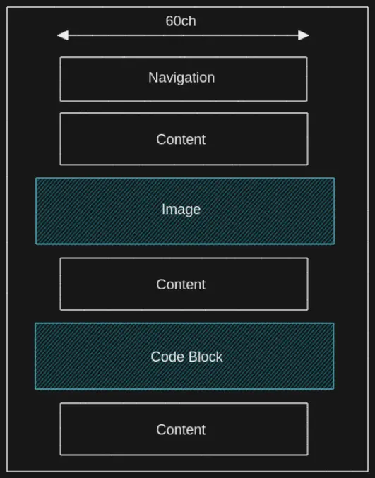
.post {
display: grid;
grid-template-columns: 2rem minmax(0, var(--reading-length)) 2rem;
justify-content: center;
row-gap: var(--spacing-2);
}
.post > * {
grid-column: 2/3;
}
/* span image and code blocks outside regular layout */
@media (min-width: 640px) {
.post {
grid-template-columns: 4rem minmax(0, var(--reading-length)) 4rem;
}
.post .container {
grid-column: 1/-1;
}
.post .rehype-code-title {
grid-column: 1/-1;
}
.post .code-block {
grid-column: 1/-1;
}
}
.post .rehype-code-title {
display: flex;
align-items: center;
margin-bottom: -2rem;
padding: 0.6rem 1rem;
color: var(--color-code-title);
background-color: var(--color-code-block);
border-bottom: 1px solid var(--color-code-border);
border-radius: 4px 4px 0 0;
}
.post h1 {
margin: var(--spacing-2) 0;
font-size: var(--font-primary);
}
.post h2 {
margin-top: var(--spacing-1);
font-size: var(--font-secondary);
}
.post h3 {
font-size: var(--font-tertiary);
}
.post p {
font-size: var(--font-text);
line-height: var(--line-height-text);
}
.post ol,
.post ul {
display: flex;
flex-direction: column;
gap: var(--spacing-1);
list-style-position: inside;
}
.post ul ul {
padding: var(--spacing-1) 0 0 var(--spacing-1);
list-style-type: disc;
}
.post ul.contains-task-list {
margin-bottom: var(--spacing-2);
list-style-type: none;
}
.post img {
max-width: 100%;
height: 100%;
display: block;
border-radius: var(--radius-base);
}
.post blockquote {
padding: var(--spacing-1);
border-left: 2px solid var(--color-blockquote);
}
/*
Utility
*/
.sr-only {
position: absolute;
width: 1px;
height: 1px;
padding: 0;
margin: -1px;
overflow: hidden;
clip: rect(0, 0, 0, 0);
white-space: nowrap;
border-width: 0;
}
`
export default stylesimport css from 'styled-jsx/css'
const prism = css.global`
/*
Syntax highlight
*/
pre {
padding: var(--spacing-1);
border-radius: var(--radius-base);
border-radius: 0 0 4px 4px;
background-color: var(--color-code-block);
box-shadow: 0px 4px 2px hsl(0, 0%, 0%, 10%);
overflow-x: scroll;
}
code[class*='language-'],
pre[class*='language-'] {
color: var(--color-token-1);
font-family: var(--font-mono);
direction: ltr;
text-align: left;
white-space: pre;
word-spacing: normal;
word-break: normal;
line-height: 1.5;
tab-size: 2;
hyphens: none;
}
/* code blocks */
pre[class*='language-'] {
margin: 0.5em 0;
padding: 1em;
overflow: auto;
}
/* inline code */
:not(pre) > code {
padding: 0.4em;
border-radius: 0.3em;
color: var(--color-text-inline);
background-color: var(--color-code-inline);
}
.token.comment,
.token.prolog,
.token.cdata {
color: var(--color-token-2);
}
.token.delimiter,
.token.boolean,
.token.keyword,
.token.selector,
.token.important,
.token.atrule {
color: var(--color-token-3);
}
.token.operator,
.token.punctuation,
.token.attr-name {
color: var(--color-token-2);
}
.token.tag,
.token.tag .punctuation,
.token.doctype,
.token.builtin {
color: var(--color-token-4);
}
.token.entity,
.token.number,
.token.symbol {
color: var(--color-token-5);
}
.token.property,
.token.constant,
.token.variable {
color: var(--color-token-3);
}
.token.string,
.token.char {
color: var(--color-token-6);
}
.token.attr-value,
.token.attr-value .punctuation {
color: var(--color-token-2);
}
.token.url {
color: var(--color-token-6);
text-decoration: underline;
}
.token.function {
color: var(--color-token-4);
}
.token.regex {
background-color: var(--color-token-6);
}
.token.bold {
font-weight: bold;
}
.token.italic {
font-style: italic;
}
.token.inserted {
background-color: var(--color-token-2);
}
.token.deleted {
background-color: var(--color-token-3);
}
/*
Line highlight
*/
.code-highlight {
width: 100%;
float: left;
}
.code-line {
display: block;
padding-right: 16px;
padding-left: 16px;
margin-right: -16px;
margin-left: -16px;
}
.highlight-line {
margin-right: -16px;
margin-left: -16px;
background-color: var(--color-code-line-highlight);
}
.line-number::before {
content: attr(line);
margin-left: -8px;
padding-right: 16px;
color: var(--color-code-line-number);
}
`
export default prismLayout
This is the general layout of the site but for posts we use a grid where we extend images and code blocks outside the grid because it looks cool.
We’re going to create a general layout wrapper for regular pages and one for our posts that’s going to hold the navigation and SEO.
Create the layout folder inside components with Blog.tsx and Container.tsx:
components/layout/Blog.tsxcomponents/layout/Container.tsx
Let’s first edit Blog.tsx.
import { Navigation } from '@/root/components/Navigation'
import styles from '@/root/styles/style'
import prism from '@/root/styles/prism'
import Seo from '@/root/components/Seo'
import { Post } from '@/root/types/post'

interface BlogProps {
  children: React.ReactNode
  metadata?: Post
}

export default function Blog({ children, metadata }: BlogProps) {
  return (
    <div>
	  <Seo {...metadata} />
      <Navigation />
      <main className="post">{children}</main>

	  <style jsx global>
        {styles}
      </style>

      <style jsx global>
        {prism}
      </style>
    </div>
  )
}
We’re going to target the elements inside post using CSS in our global styles. Inside [slug].tsx we can wrap <Component /> with <Blog /> and pass it metadata.
// ...
import Blog from '@/root/components/layout/Blog'

// ...
export default function Post({ code, metadata }: PostProps) {
  const Component = useMemo(() => getMDXComponent(code), [code])

  return (
    <Blog metadata={metadata}>
      <Component components={mdxComponents as any} />
    </Blog>
  )
}
Let’s do the same for Container.tsx that’s meant to be used for other general pages.
import { Navigation } from '@/root/components/Navigation'
import Seo from '@/root/components/Seo'
import styles from '@/root/styles/style'
import prism from '@/root/styles/prism'
import { Post } from '@/root/types/post'

interface ContainerProps {
  children: React.ReactNode
  metadata?: Post
}

export default function Container({ children, metadata }: ContainerProps) {
  return (
    <div>
      <Seo {...metadata} />
      <Navigation />
      <main>{children}</main>

      <style jsx>
        {`
          main {
            padding: 0 var(--spacing-2);
          }

          @media (min-width: 640px) {
            main {
              width: var(--reading-length);
              margin: 0 auto;
              padding: var(--spacing-2) 0;
            }
          }
        `}
      </style>

      <style jsx global>
        {styles}
      </style>

      <style jsx global>
        {prism}
      </style>
    </div>
  )
}
Then use it for the home page inside index.tsx.
// ...
import Container from '@/root/components/layout/Container'

// ...
export default function Home({ posts }: HomeProps) {
  return (
    <Container>
      <h2>Latest Posts</h2>
      <Posts posts={posts} />
    </Container>
  )
}
Dark Mode
So far everything works except our colors because we’re applying them based on if <body> has the data attribute of dark or light. We just need to create the dark mode toggle ThemeToggle.tsx inside components:
components/ThemeToggle.tsx
The component has a <ThemeToggle /> component that has the logic and a presentational <Toggle /> component.
I found the toggle component on Codepen and cleaned it up and turned the values into CSS variables.Thanks to Adding a Dark / Light Mode Toggle to Next.js Using CSS Variables because it explains how to solve the flashing issue when you save a theme to localStorage and refresh the page because of how server-side hydration works.
import { useEffect, useState } from 'react'

interface ToggleProps {
  checked: boolean
  toggle: () => void
}

function Toggle({ checked, toggle }: ToggleProps) {
  return (
    <div className="toggle">
      <input onChange={toggle} type="checkbox" id="toggle" checked={checked} />
      <label htmlFor="toggle">
        <span className="sr-only">Dark Mode Toggle</span>
      </label>

      <style jsx>
        {`
          .toggle {
            --width: 80px;
            --height: 40px;
            --radius-circle: 20px;
            --translate-x-moon: 34px;
            --translate-x-mask: 96px;

            transition: var(--transition-color);
          }

          label {
            width: var(--width);
            height: var(--height);
            display: block;
            position: relative;
            background-color: var(--color-toggle);
            border-radius: 50px;
            overflow: hidden;
            cursor: pointer;
          }

          label:before,
          label:after {
            content: '';
            width: var(--radius-circle);
            height: var(--radius-circle);
            position: absolute;
            top: 10px;
            left: 14px;
            border-radius: 50%;
            transition: transform 0.5s ease;
          }

          label:before {
            background-color: var(--color-toggle-sun);
          }

          label:after {
            background-color: var(--color-toggle-mask);
            left: -58px;
          }

          input[type='checkbox'] {
            display: none;
          }

          input[type='checkbox']:checked + label:before {
            background-color: var(--color-toggle-moon);
            transform: translateX(var(--translate-x-moon));
          }

          input[type='checkbox']:checked + label:after {
            transform: translateX(var(--translate-x-mask));
          }
        `}
      </style>
    </div>
  )
}

export default function ThemeToggle() {
  const selectedTheme = document.body.dataset.theme ?? 'dark'
  const [theme, setTheme] = useState<string>(selectedTheme)
  const checked = theme === 'dark' ? true : false
  const flipTheme = theme === 'dark' ? 'light' : 'dark'

  useEffect(() => {
    document.body.dataset.theme = theme
    localStorage.setItem('theme', theme)
  }, [theme])

  function handleToggle() {
    setTheme(flipTheme)
  }

  return <Toggle checked={checked} toggle={handleToggle} />
}
As mentioned from the post I linked to get the theme from the browser we have to first get the value before Next.js hydrates the page. If you remember from earlier we can hook into the DOM using _document.tsx, so create it:
pages/_document.tsx
If you changed _document.tsx you might have to restart the development server. Most of this is just Next.js boilerplate from the documentation. The only thing we added is setInitialTheme and inserted the <script>.
import Document, {
  Html,
  Head,
  Main,
  NextScript,
  DocumentContext,
} from 'next/document'

export default class MyDocument extends Document {
  static async getInitialProps(ctx: DocumentContext) {
    const initialProps = await Document.getInitialProps(ctx)
    return { ...initialProps }
  }

  render() {
    const setInitialTheme = `
      function getUserPreference() {
        if (window.localStorage.getItem('theme')) {
          return window.localStorage.getItem('theme')
        }

        return window.matchMedia('(prefers-color-scheme: dark)').matches
          ? 'dark'
          : 'light'
      }

      document.body.dataset.theme = getUserPreference()
    `

    return (
      <Html>
        <Head />
        <body>
          <script dangerouslySetInnerHTML={{ __html: setInitialTheme }} />
          <Main />
          <NextScript />
        </body>
      </Html>
    )
  }
}
After that we have to dynamically load the <ThemeToggle /> component using next/dynamic to avoid running the code on the server. We’re going to add it inside Navigation.tsx.
// ...
import dynamic from 'next/dynamic'

// we don't want to run the code on the server
const ThemeToggle = dynamic(() => import('./ThemeToggle'), { ssr: false })

// ...
export function Navigation() {
  return (
    <nav>
      <Links />
      <ThemeToggle />
    </nav>
  )
}
We have a working theme we can save to local storage but we also respect the user’s preference if no theme is set.
Deploy
You don’t have to pay anything for hosting your static site unless for some weird reason you’re uploading gigabytes of images. Even server-side rendering doesn’t cost anything because when someone visits a page it’s going to request it once and then cache it for others.
If your project is open source and non-commercial you can request a sponsorship from Vercel. You can deploy the site in a couple of steps:
- Push your project to GitHub
- Create an account on Vercel
- When you’re logged in to Vercel tap the New Project button
- Point Vercel to your repository
You shouldn’t have any problems but you can always try npm run build on your machine to see if your site builds first and solve any issues before you deploy. If you come across any errors don’t panic but calmly read the log output because it’s just like reading your terminal but it’s on another server.
You can also change the URL that’s generated for you to something else with *.vercel.app at the end also at no cost. If you want a cheap domain name .xyz domains are around $1 / year on Namecheap and I use it for this site and my portfolio.
Conclusion
Congrats! 🥳
You can get the final project files here.
I hope you learned about Next.js but more importantly I hope you’re going to write and share your knowledge with others.
Have a look at Shiki if you want to play around with a modern syntax highlighter. You can also create more themes like I have on Joy of Code by giving the theme a name and targeting it with body[data-theme='theme'] in CSS.
Thanks for reading! 🏄