Best Practices When Using Fonts
Published May 15, 2021
Table of Contents
- Web Fonts
- Taking a Closer Look At The Google Fonts Stylesheet
- What is Unicode Anyhow
- The Benefits of Using a CDN
- The Reason to Host Your Fonts
- Hosting Your Fonts
- @font-face
- Size Consideration
- Flash of Unstyled Content
- Variable Fonts Are The Future of Fonts
- How to Subset Fonts
- Summary
Web Fonts
In the past we could only use a handful of fonts considered web-safe because they were guaranteed to be on each computer. Thanks to CSS, we can specify any font files to be downloaded, and used when someone opens our site. You’ve probably used Google Fonts — one of the most popular font providers. You only have to grab a link to a font, and include it in your site.
<link
  rel="preconnect"
  href="https://fonts.gstatic.com"
/>
<link
  href="https://fonts.googleapis.com/css2?family=Inter&display=swap"
  rel="stylesheet"
/>
The preconnect keyword is saying: “Hey, we’re going to talk to this resource for sure, so let’s pick up the phone.” It’s a hint to the browser to establish a connection as soon as possible (while it’s loading your CSS file, it can resolve that URL).
It’s only a suggestion to the browser, since browsers already try to anticipate what connections a page might need — so it might be ignored completely.
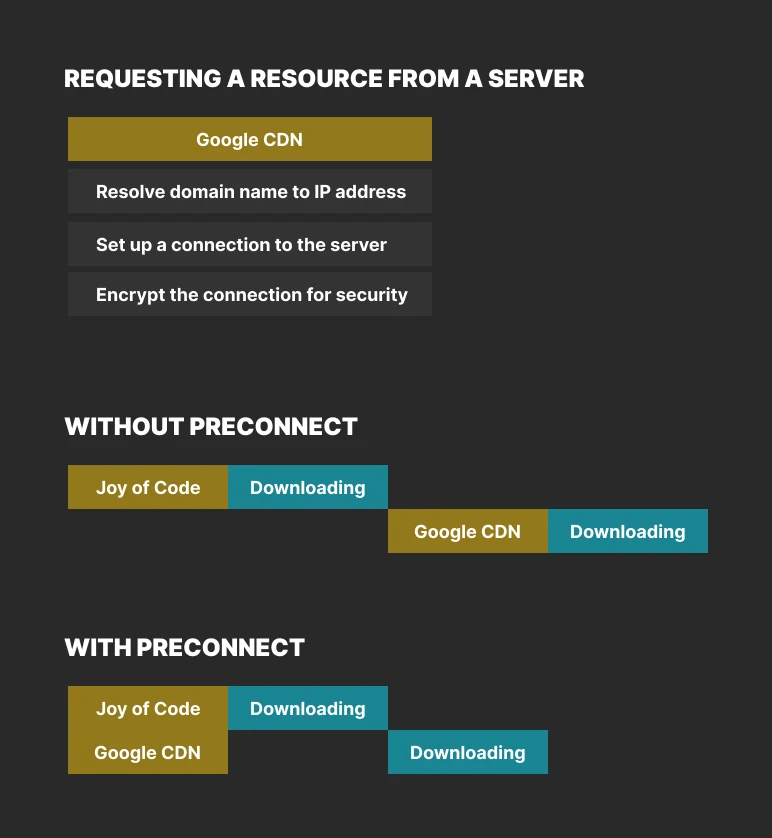
In each of these steps the browser sends a piece of data to a server, and the server sends back a response. That journey, from origin to destination and back, is called a round trip. — Establish network connections early to improve perceived page speed
Without preconnect, we would have to make a round trip when requesting a resource — when it’s easier to open a phone line at page load.
The stylesheet we load is interesting, because whatever parameters we pass — it gets generated on the fly. In this case we’re saying: “Give me the font Inter, with the default weight.” There’s an interesting display property swap that says “If the font hasn’t loaded yet, swap it for another.” This is defined in @font-face.
Why not add some more weights, and fonts?
<!-- Inter -->
<link
  href="https://fonts.googleapis.com/css2?family=Inter:wght@400;700&display=swap"
  rel="stylesheet"
/>

<!-- Playfair Display -->
<link
  href="https://fonts.googleapis.com/css2?family=Playfair+Display:wght@400;700&display=swap"
  rel="stylesheet"
/>
We can reduce the amount of HTTP requests by requesting multiple fonts inside one request.
<!-- Inter, Playfair Display -->
<link
  href="https://fonts.googleapis.com/css2?family=Inter:wght@400;700|Playfair+Display:wght@400;700&display=swap"
  rel="stylesheet"
/>
Instead of including it in our HTML, we can also import it in our CSS using the @import syntax.
@import url('https://fonts.googleapis.com/css2?family=Inter&display=swap');This is pure preference, and has no impact on performance. You can read don’t use @import that talks about why you shouldn’t use it for importing CSS — which is not the case here.
Taking a Closer Look At The Google Fonts Stylesheet
I encourage you to open the Google Fonts stylesheet. I’m going to wait.
Whoa! This might seem like a lot at first. Fortunately, we only have to look at one example to understand the rest.
/* latin */
@font-face {
  /* name of the font */
  font-family: 'Inter';
  /* normal, italic, oblique */
  font-style: normal;
  /* weight 100-900 */
  font-weight: 400;
  /* link to font, and format so browser knows what to do */
  src: url(Inter.woff2) format('woff2');
  /* unicode characters to use */
  unicode-range:
    U+0000-00FF, /* Basic Latin, and Latin-1 Supplement */
    U+0152-0153, /* Latin Extended-A */
    U+02BB-02BC, /* spacing modifier letters */
    U+2000-206F, /* general punctuation */
    /* ... */
}
I took some artistic liberties to change the snippet for the purposes of explanation.
Can you imagine if a font you used included every possible letter, and symbol that exists? It’s possible! 😱
Instead of making our users download large fonts, we can declare a range from the font.
We use the unicode-range property to say: “Only load this font, if a character from this range is used”. This is useful in cases where:
- You have localization where you support multiple languages, but only load the language the user is using
- You can also use this for replacing a character from a different font
@font-face {
  font-family: 'Ampersand';
  src: url('FancyFont.woff2');
  /* only use the fancy font's ampersand */
  unicode-range: U+26;
}

h1 {
  /* otherwise use any sans-serif font */
  font-family: Ampersand, sans-serif;
}
Keep in mind if you’re swapping characters using unicode-range, the @font-face order matters.
You can learn more about some of these techniques by reading about unicode-range on MDN, or listen to a great @font-face explainer episode from The CSS podcast.
What is Unicode Anyhow
Every language has a character set. Basic Latin contains a Unicode block of 128 characters for English, and other Western languages.
I’m from 🇭🇷 Croatia, so we have other special characters such as “š, đ, č, ć, ž”. These are included in Latin Extended-A.
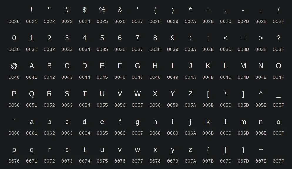
This shows the Basic Latin unicode range U+0020-007F.
Unicode is a standard maintained by the Unicode Consortium that aims to solve the limitations of ASCII by having a unique list of characters, and symbols ordered by number.
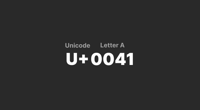
For example, take the letter A. In Unicode this letter is represented as U+0041. These code points are in hexadecimal — preceded by U+. If we used a Hex to ASCII Text Converter, we would get the same result.
We can see the basic Latin range more easily using a site like Unicode Character Table. You can read Unicode, UTF8 & Character Sets: The Ultimate Guide if you want to learn more.
For the unicode range we can see it includes U+0000-00FF which is Latin-1 Supplement, and some special characters such as U+02DC which is the small tilde (~).
Phew! That’s a lot of explaining out of the way. Understanding this isn’t just for the sake of curiosity, because this is the foundation of everything we’re going to cover next. I’m going to cover more on @font-face in the self-hosting section.
First let’s understand why do we even use hosted fonts in the first place, and reasons why you should self-host.
The Benefits of Using a CDN
When transfering data we have to take distance into consideration. CDN means content delivery network. It’s a proxy server between you and the real server.
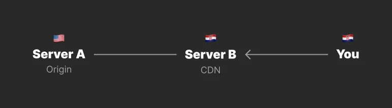
- Server A can cache it’s files on Server B that’s closer to you
- When you visit Server A, you hit Server B first which gives you the cached data
- If there’s an update, Server A is going to send fresh data to Server B to be cached for future visits
- The initial load is going to be slower for the person who made the first request, but fast for subsequent visits
If you remember — https://fonts.gstatic.com is the CDN for Google Fonts. Because of this global content delivery network, when a user requests a font it can be served from the nearest cached location.
The Reason to Host Your Fonts
The browser also has a HTTP cache — which serves as a temporary storage for any assets you downloaded browsing other sites so future requests are served faster.
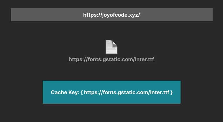
- A user visits https://joyofcode.xyz/
- The request to https://fonts.gstatic.com/Inter.ttf is made
- Where the font is cached using the URL as the cache key
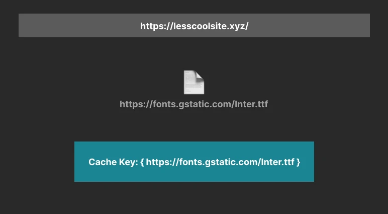
- The same user visits https://lesscoolsite.xyz/ which request the same font
- It hits the HTTP cache and uses the cached version
However, the problem with this approach is:
HTTP requests can reveal that the browser has accessed the same resource in the past, which opens the browser to security and privacy attacks. — Gaining security and privacy by partitioning the cache
For this reason, browsers aren’t using one big cache for everything anymore — but cache on a per-site basis:
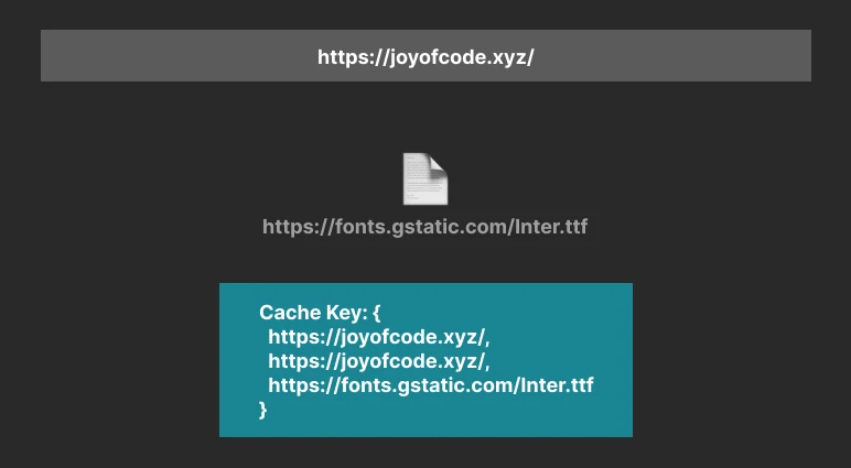
- User visits https://joyofcode.xyz/
- Request to https://fonts.gstatic.com/Inter.ttf is made
- The cache key consists of the top site (root of the site), current-frame site (children of the site, or iframe), and the resource URL
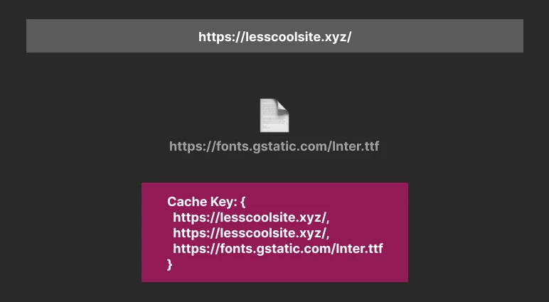
- The same user visits https://lesscoolsite.xyz/
- Creates a request for the same resource
- Since the key doesn’t match, the HTTP cache won’t be hit
Because of this change, the recommended approach is to self-host your fonts if you want to benefit from caching.
I want to note that despite being the recommended approach going forward, it might not be worth it for everyone. If you’re using variable fonts, which Google Fonts serves by default for fonts that support it (foreshadowing 🕵), the size of the font is almost irrelevant for normal use.
That being said, self-hosting opens up further possibilities to optimize, and have ownership of your content. We’re going to cover that next.
Hosting Your Fonts
Fonts come in many formats, but the most used ones on the web you’re going to encounter are:
- TrueType (ttf)
- Web Open Font Format (woff)
- Web Open Font Format 2 (woff2)
TrueType was developed by Apple in the late 1980s, and is what’s used on most computers. Web Open Font Format uses OpenType, or TrueType fonts that are compressed for the web.
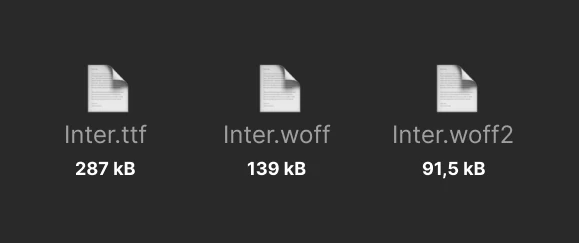
This shows over a 100% reduction in file size.
Having a 30% reduction in size for most cases over WOFF — WOFF 2 is what you should always use.
We’re going to get into some Command-line interface (CLI) tools later when it comes to optimizing, and converting fonts. You can already convert non-variable fonts online for an easy win.
@font-face
I found Google Webfonts Helper to be great since it generates the styles for you, lets you specify the character sets, and gives you many formats.
Assuming you have your font downloaded already which you can do from Google Fonts, Font Squirrel, or DaFont the simplest way to declare a font is:
/* regular variant  */
@font-face {
  font-family: 'Inter';
  font-style: normal;
  font-weight: 400;
  font-display: swap;
  src: url('Inter-Regular.woff2') format('woff2');
}

/* bold variant  */
@font-face {
  font-family: 'Inter';
  font-style: normal;
  font-weight: 700;
  font-display: swap;
  src: url('Inter-Bold.woff2') format('woff2');
}

/* you can declare a fallback */
@font-face {
  font-family: 'Inter';
  font-style: normal;
  font-weight: 400;
  font-display: swap;
  src:  url('Inter-Regular.woff2') format('woff2'),
        url('Inter-Regular.ttf') form('truetype');
}
- font-family — is used to refer to the font, you can give it any name
- font-style — can be normal, italic, oblique (keep in mind you have to include an italic version of the font, since it only makes the regular glyphs slanted, and hideous)
- font-weight — are numbers mapped to weight names: 100 (Thin), 200 (Extra Light), 300 (Light), 400 (Normal), 500 (Medium), 600 (Semi Bold), 700 (Bold), 800 (Extra Bold), 900 (Black)
- font-display — determines how a font is displayed depending on if it’s loaded, or not
The only thing left to do is serve the fonts which depends on your hosting. Treat them as any other static asset. In general, you want to place them in some public folder. I simply include mine in public/fonts for Next.js. That way it’s a relative path, for example https://joyofcode.xyz/fonts/Inter.woff2.
To use the font simply use it in your CSS, and include a fallback stack of system UI fonts:
body {
  font-family: 'Inter', -apple-system, BlinkMacSystemFont,
    'Segoe UI', 'Roboto', 'Oxygen', 'Ubuntu', 'Cantarell',
    'Fira Sans', 'Droid Sans', 'Helvetica Neue',
    sans-serif;
}
I believe this was popularized by GitHub, but I don’t know for sure. To be honest, in most cases I only include serif, or sans-serif as the fallback, depending on the font type.
Another fallback tip is that you should use a system UI font that resembles your font as closely as possible due to Flash of unstyled content (FOUC).
Size Consideration
The problem with using non-variable fonts is that you have to be careful with what you include. Including each font weight requires a separate file meaning an additional HTTP request, and declaring @font-face for each one (you can get around this by combining fonts into a single file).
For example if we wanted to use every weight of Inter, that’s 9 HTTP requests in total. It gets worse — that’s around ~1.8 MB (assuming we’re using WOFF 2, otherwise it’s more than double). To put things into perspective, the regular weight of Inter is around ~98 kB.
How much is too much when it comes to sending data through the pipe? The bundle size of a framework such as React is ~128 kB before it’s minified, and gzipped being around ~42 kB. You don’t want to ship React to display text.
The more things you have to download, while having unreliable internet is a frustrating experience. Let’s adress other issues this causes.
Flash of Unstyled Content
A flash of unstyled content (FOUC, also flash of unstyled text) is an instance where a web page appears briefly with the browser’s default styles prior to loading an external CSS stylesheet, due to the web browser engine rendering the page before all information is retrieved. The page corrects itself as soon as the style rules are loaded and applied; however, the shift may be distracting. Related problems include flash of invisible text (FOIT) and flash of faux text (FOFT). - Flash of unstyled content (Wikipedia)
I disabled the cache in the developer tools, and used a slow connection to simulate what you might experience. I’ve noticed there’s a lot of weird things that can go wrong, regardless of your network speed. The same can happen on a fast connection when a resources takes longer than expected, so it’s not just people with slow unreliable internet.
To exagerate the effect, I’ve defined the fallback to use a serif font so it’s more obvious.
body {
  font-family: 'Inter', serif;
}
We briefly went over font-display earlier, but this time let’s explore it further. The values range from auto, block, swap, fallback, and optional. By default it uses auto which leaves it up to the browser, where most browsers use block.

Block gives the font a short block period, and an infinite swap period — this means until the font is ready to use, it should use “invisible” text, and swap once it’s ready. This creates a ugly user experience as you can see, and causes layout shifts.

Swap gives the font a zero second block period and an infinite swap period — this means the browser uses the fallback font immediately, until the font is loaded. This is the one that Google Fonts uses by default. It’s important to have visible text when you visit a site. It’s not the perfect solution, but works great if you use a similar looking fallback font.

Fallback gives the font face an extremely small block period (100 ms), and a short swap period (3 seconds) — similar to swap, if the font is not ready, it loads the fallback immediately. However, if the font doesn’t load in a reasonable time, the fallback is going to be used.

Optional gives the font face an extremely small block period (100 ms), and a zero second swap period — you should use this, if the font you’re using is unimportant to how your site looks. Otherwise it’s going to be a jarring experience.
The conclusion is that there’s no best option to use regardless what anyone says. You have to understand the trade-offs. To alleviate analysis paralysis, swap or optional should serve you well in most situations. You can read Controlling Font Performance with font-display to learn more.
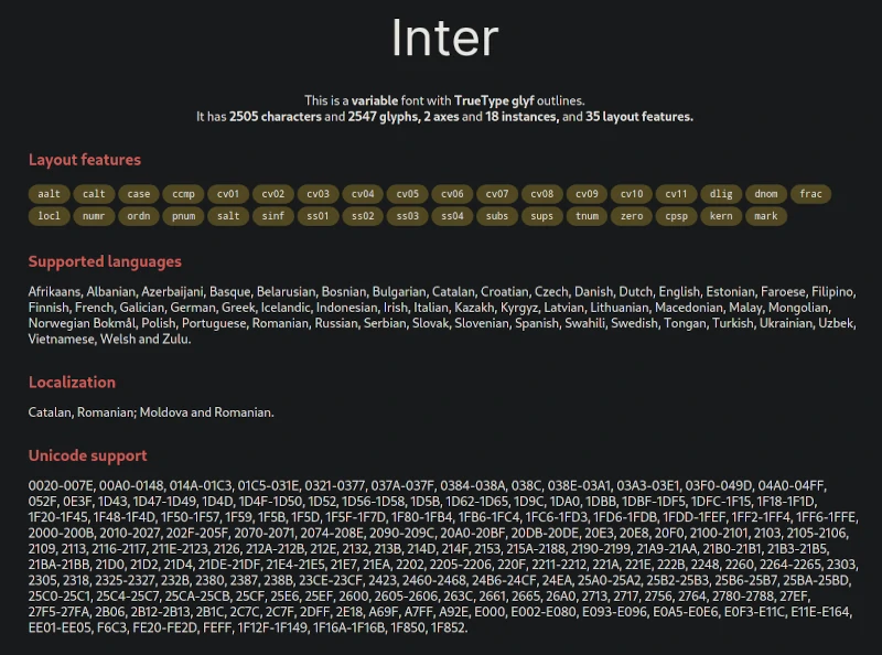
Variable Fonts Are The Future of Fonts
I’m going to give you the TL;DR since you can do crazy things with variable fonts.
Rather than having a separate font file for every width, weight, or style — variable fonts contain them in a single file.
The only other aspect of variable fonts you should understand is the concept of axis. Axis are a specified range of controls for features such as weight, width, slant, optical size, italics, and custom ones.
@font-face {
  font-family: 'Inter Variable';
  src: url('Inter-Variable.woff2') format('woff2');
  /*  we can also specify a range 100...900 */
  font-weight: 400 700 900;
  font-display: swap;
}

body {
  font-family: 'Inter Variable', sans-serif;
}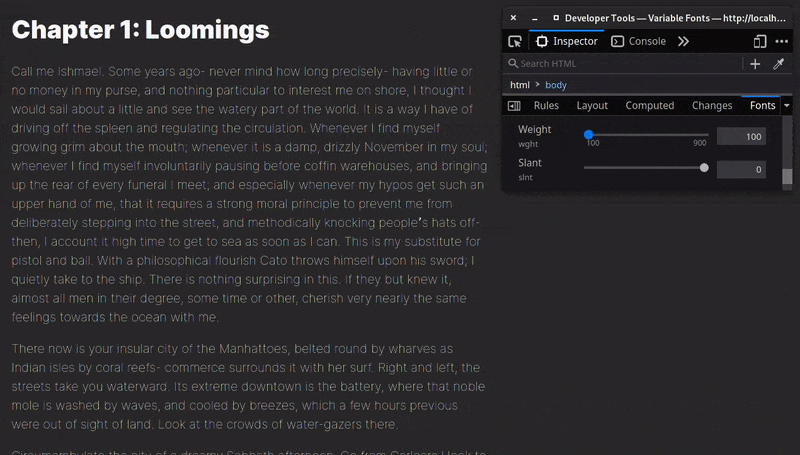
The variable font version of Inter has a weight, and slant axis. The best part is that’s it’s a fraction of the size. I like to think of variable fonts as being the SVG of fonts. If you ever wrote a media query that reduces the size of text for example, think how it snaps instead of being fluid. You can get that smooth transition with variable fonts.
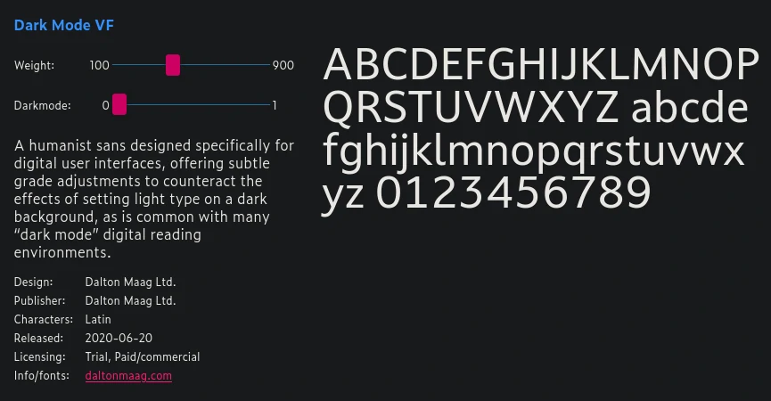
This is an example of a custom axis — meant to offset a light font looking thin on a dark background by adjusting the grade which changes the weight of the font without changing it’s width.
You can play around with more examples on Variable Fonts, to understand what variable fonts can do. If you want to learn more, you can read Introduction to variable fonts on the web that has great explanations with graphics.
Google Fonts already serves variable fonts by default. You can look at the complete list of Google variable fonts.
<link
  href="https://fonts.googleapis.com/css2?family=Inter:wght@400;700;900&display=swap"
  rel="stylesheet"
/>
Notice how significantly smaller the size is at ~17 kB, compared to ~98 kB per-weight for the non-varible WOFF 2 version (we could save perhaps 30% if it was gzipped) — if we combined these weights it would barely come to ~54 kB. We can do a lot more optimization on top of this.
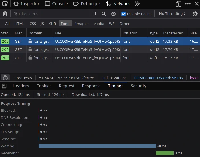
I also wanted to show going back to our preconnect section earlier — how there was no time spent connecting to the Google Fonts CDN, since the browser has already done that part.
Interestingly enough — it serves a file for each weight when variable fonts promise us a single file. That’s for a good reason. If we looked at the file size of a single file variable font — it’s astronomical. For example the TTF version of Inter is ~800 kB, and the WOFF 2 version is around ~320 kB. We’re left with a couple of options:
- Use Google Fonts if the font you want is supported
- Download, and use the variable font Google Fonts generates
- Decrease the size of the file by using a technique that’s meant to subset the fonts decreasing the file size dramatically
How to Subset Fonts
Remember our adventure into unicode?
The idea behind creating font subsets is simple — we can specify a unicode range to remove characters we don’t need.
The problem with most online converters, and tools I tried is they completeley strip out the variations from the variable font in the process. You can use Wakamai Fondue to drop a font, and learn what it can do.
At the time of writing this the only reliable method is having to use pyftsubset which is part of fonttools (which means having to use Python). There’s some other JavaScript libraries such as glyphhanger that you can use — but they also require having those dependencies, and are just an abstraction on top. glyphanger is interesting because it can crawl your site, and create a tiny subset based on what characters you use. Fortunately, it’s simple — even if you don’t have any Python experience like me.
Make sure you have Python installed, and add it to your path if you’re on Windows (look at the installer options) — it comes with pip which is a package manager for Python like npm is for JavaScript. I’m using Linux, so I already have it. The same should be true for macOS. You can confirm by opening you terminal:
python --versionpip --versionIf you’re all set, it’s time to install a couple of packages:
pip install fonttools brotli- fonttools are required for pyftsubset
- Brotli is used to compress WOFF 2 files
Let’s create the same Latin subset we’ve seen Google Fonts use:
pyftsubset \
 Inter-Variable.ttf \
 --output-file="Inter-Variable-English.woff2" \
 --flavor="woff2" \
 --layout-features="*" \
 --unicodes="U+0000-00FF,U+0131,U+0152-0153,U+02BB-02BC,\
  U+02C6,U+02DA,U+02DC,U+2000-206F,U+2074,U+20AC,\
  U+2122,U+2191,U+2193,U+2212,U+2215,U+FEFF,U+FFFD"
The backwards slash let’s us split text into multiple lines.
- We specify our font — Inter-Variable.ttf
- Then we give the output a name — Inter-Variable-English.woff2
- Specify the font format — woff2
- Layout features — feature tags such as kern let us justify the space between glyphs, liga replaces a sequence of glyphs with a single glyph, or we can specify everything with the asterisk
- As a last step we give it the Latin unicode range
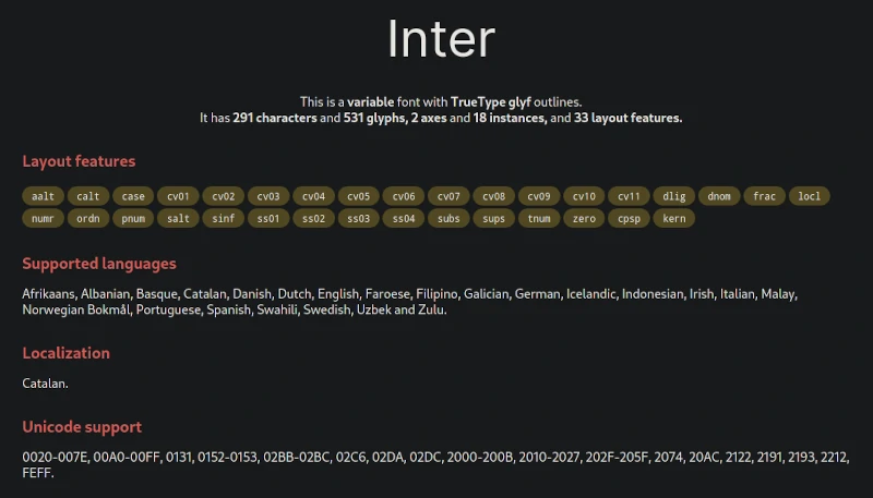
The file size is around ~77 kB before gzip compared to ~800 kB. Keep in mind, we’re using the same Latin subset, with all font weights in a single file. We can further optimize this to only use a English-subset, removing more characters.
I highly recommend reading Creating font subsets as it’s packed with information if you want to further customize such as creating multiple subsets like Google Fonts.
pyftsubset \
  Inter-Regular.ttf \
  --output-file="Inter-Regular-Latin.woff2" \
  --flavor="woff2" \
  --layout-features="*" \
  --unicodes="U+0000-00FF" &&

pyftsubset \
  Inter-Regular.ttf \
  --output-file="Inter-Regular-Latin-Extended-A.woff2" \
  --flavor="woff2" \
  --layout-features="*" \
  --unicodes="U+0100-017F"
Speaking of Google fonts — you can specify the variable font weight range, but also subset it using their API.
<link
  href="https://fonts.googleapis.com/css2?family=Inter:wght@100..900"
  rel="stylesheet"
/>
You can specify a text parameter that is only going to include a font file that has those letters.
<link
  href="https://fonts.googleapis.com/css2?family=Inter&text=Hello,World!"
  rel="stylesheet"
/>
Don’t forget, you can also combine other parameters such as display. You can learn more if you read the Google Fonts API docs.
Summary
- You should always use variable fonts since they’re supported in most browsers (except Internet Explorer) with a global usage of ~92%
- Always use WOFF 2 since it has the highest compression
- Self-host your fonts if you want browser caching, and fine-grained control
- Take advantage of font subsets, but also don’t overdo it — you might think you only want English, but there might be cases where you have to use diacritics from other languages
- Your goal shouldn’t be size, but to deliver the best user experience by finding balance, and understanding the trade-offs