Build a SvelteKit Markdown Blog
Published Apr 28, 2023
Table of Contents
- Project Setup
- Layout And Styles
- Setting Up Mdsvex
- Posts API Endpoint
- Rendering The Posts
- Rendering A Single Post
- Syntax Highlighting
- Using Components Inside Markdown
- Using Markdown Plugins
- Light And Dark Mode Toggle
- Page Transitions
- RSS Feed
- Custom Error Page
- Deployment
Project Setup
🔥 The post has been updated for Svelte 5.
You’re going to make a blazingly fast and extendable SvelteKit Markdown blog you can be proud of and deploy it to Vercel at no cost.
You can find the finished project on GitHub.
🔥 If you want to learn SvelteKit you can watch The Complete SvelteKit Course For Building Modern Web Apps on YouTube.
Start by creating a new SvelteKit project:
npx sv createUse the Enter key to select the SvelteKit minimal template and TypeScript. You can use the Space key to select ESLint to lint your code for errors and Prettier to format the code:
┌  Welcome to the Svelte CLI!
│
◇  Where would you like your project to be created?
│  sveltekit-blog
│
◇  Which template would you like?
│  SvelteKit minimal
│
◇  Add type checking with Typescript?
│  Yes, using Typescript syntax
│
◆  Project created
│
◇  What would you like to add to your project? (use arrow keys / space bar)
│  prettier, eslint
│
◇  Which package manager do you want to install dependencies with?
│  npm
Open the development server at http://localhost:5173/:
npm run devLayout And Styles
Here’s what I’m going to use:
- Open Props for styling using CSS variables instead of utility classes like Tailwind
- Lucide for icons
- Atkinson Hyperlegible for text and JetBrains Mono for the code
npm i open-props lucide-svelte @fontsource/atkinson-hyperlegible @fontsource/jetbrains-monoLet’s update the favicon inside app.html:
<!DOCTYPE html>
<html lang="en">
	<head>
		<meta charset="utf-8" />
		<meta name="viewport" content="width=device-width" />
		<link rel="icon" href="https://fav.farm/🔥" />
		%sveltekit.head%
	</head>
	<body data-sveltekit-preload-data="hover">
		<div style="display: contents">%sveltekit.body%</div>
	</body>
</html>
Let’s also add a config file for the blog:
import { dev } from '$app/environment'

export const title = 'Shakespeare'
export const description = 'SvelteKit blog for poets'
export const url = dev ? 'http://localhost:5173/' : 'https://joyofcode.xyz/'
Add a root layout inside src/routes/+layout.svelte that includes the header, footer and styles for the blog:
<script lang="ts">
	import Footer from './footer.svelte'
	import Header from './header.svelte'

	import 'open-props/style'
	import 'open-props/normalize'
	import 'open-props/buttons'
	import '../app.css'

	let { children, data } = $props()
</script>

<div class="layout">
	<Header />

	<main>
		{@render children?.()}
	</main>

	<Footer />
</div>

<style>
	.layout {
		height: 100%;
		max-inline-size: 1440px;
		display: grid;
		grid-template-rows: auto 1fr auto;
		margin-inline: auto;
		padding-inline: var(--size-7);

		@media (min-width: 1440px) {
			padding-inline: 0;
		}

		main {
			padding-block: var(--size-9);
		}
	}
</style><script lang="ts">
import * as config from '$lib/config'
</script>
<nav>
<a href="/" class="title">
<b>{config.title}</b>
</a>
<ul class="links">
<li>
<a href="/about">About</a>
</li>
<li>
<a href="/contact">Contact</a>
</li>
<li>
<a href="/rss.xml" target="_blank">RSS</a>
</li>
</ul>
<button>Toggle</button>
</nav>
<style>
nav {
padding-block: var(--size-7);
@media (min-width: 768px) {
display: flex;
justify-content: space-between;
}
.links {
margin-block: var(--size-7);
@media (min-width: 768px) {
display: flex;
gap: var(--size-7);
margin-block: 0;
}
}
a {
color: inherit;
text-decoration: none;
}
}
</style><script lang="ts">
import * as config from '$lib/config'
</script>
<footer>
<p>{config.title} © {new Date().getFullYear()}</p>
</footer>
<style>
footer {
padding-block: var(--size-7);
border-top: 1px solid var(--border);
p {
color: var(--text-2);
}
}
</style>@import '@fontsource/atkinson-hyperlegible';
@import '@fontsource/jetbrains-mono';
html {
/* font */
--font-system-ui: 'Atkinson Hyperlegible', sans-serif;
--font-monospace-code: 'JetBrains Mono', monospace;
/* dark */
--brand-dark: var(--orange-3);
--text-1-dark: var(--gray-3);
--text-2-dark: var(--gray-5);
--surface-1-dark: var(--gray-12);
--surface-2-dark: var(--gray-11);
--surface-3-dark: var(--gray-10);
--surface-4-dark: var(--gray-9);
--background-dark: var(--gradient-8);
--border-dark: var(--gray-9);
/* light */
--brand-light: var(--orange-10);
--text-1-light: var(--gray-8);
--text-2-light: var(--gray-7);
--surface-1-light: var(--gray-0);
--surface-2-light: var(--gray-1);
--surface-3-light: var(--gray-2);
--surface-4-light: var(--gray-3);
--background-light: none;
--border-light: var(--gray-4);
}
:root {
color-scheme: dark;
--brand: var(--brand-dark);
--text-1: var(--text-1-dark);
--text-2: var(--text-2-dark);
--surface-1: var(--surface-1-dark);
--surface-2: var(--surface-2-dark);
--surface-3: var(--surface-3-dark);
--surface-4: var(--surface-4-dark);
--background: var(--background-dark);
--border: var(--border-dark);
}
@media (prefers-color-scheme: light) {
:root {
color-scheme: light;
--brand: var(--brand-light);
--text-1: var(--text-1-light);
--text-2: var(--text-2-light);
--surface-1: var(--surface-1-light);
--surface-2: var(--surface-2-light);
--surface-3: var(--surface-3-light);
--surface-4: var(--surface-4-light);
--background: var(--background-light);
--border: var(--border-light);
}
}
[color-scheme='dark'] {
color-scheme: dark;
--brand: var(--brand-dark);
--text-1: var(--text-1-dark);
--text-2: var(--text-2-dark);
--surface-1: var(--surface-1-dark);
--surface-2: var(--surface-2-dark);
--surface-3: var(--surface-3-dark);
--surface-4: var(--surface-4-dark);
--background: var(--background-dark);
--border: var(--border-dark);
}
[color-scheme='light'] {
color-scheme: light;
--brand: var(--brand-light);
--text-1: var(--text-1-light);
--text-2: var(--text-2-light);
--surface-1: var(--surface-1-light);
--surface-2: var(--surface-2-light);
--surface-3: var(--surface-3-light);
--surface-4: var(--surface-4-light);
--background: var(--background-light);
--border: var(--border-light);
}
html,
body {
height: 100%;
}
html {
color: var(--text-1);
accent-color: var(--link);
background-image: var(--background);
background-attachment: fixed;
}
img {
border-radius: var(--radius-3);
}
ul,
ol {
list-style: none;
padding: 0;
}
li {
padding-inline-start: 0;
}
.surface-1 {
background-color: var(--surface-1);
color: var(--text-2);
}
.surface-2 {
background-color: var(--surface-2);
color: var(--text-2);
}
.surface-3 {
background-color: var(--surface-3);
color: var(--text-1);
}
.surface-4 {
background-color: var(--surface-4);
color: var(--text-1);
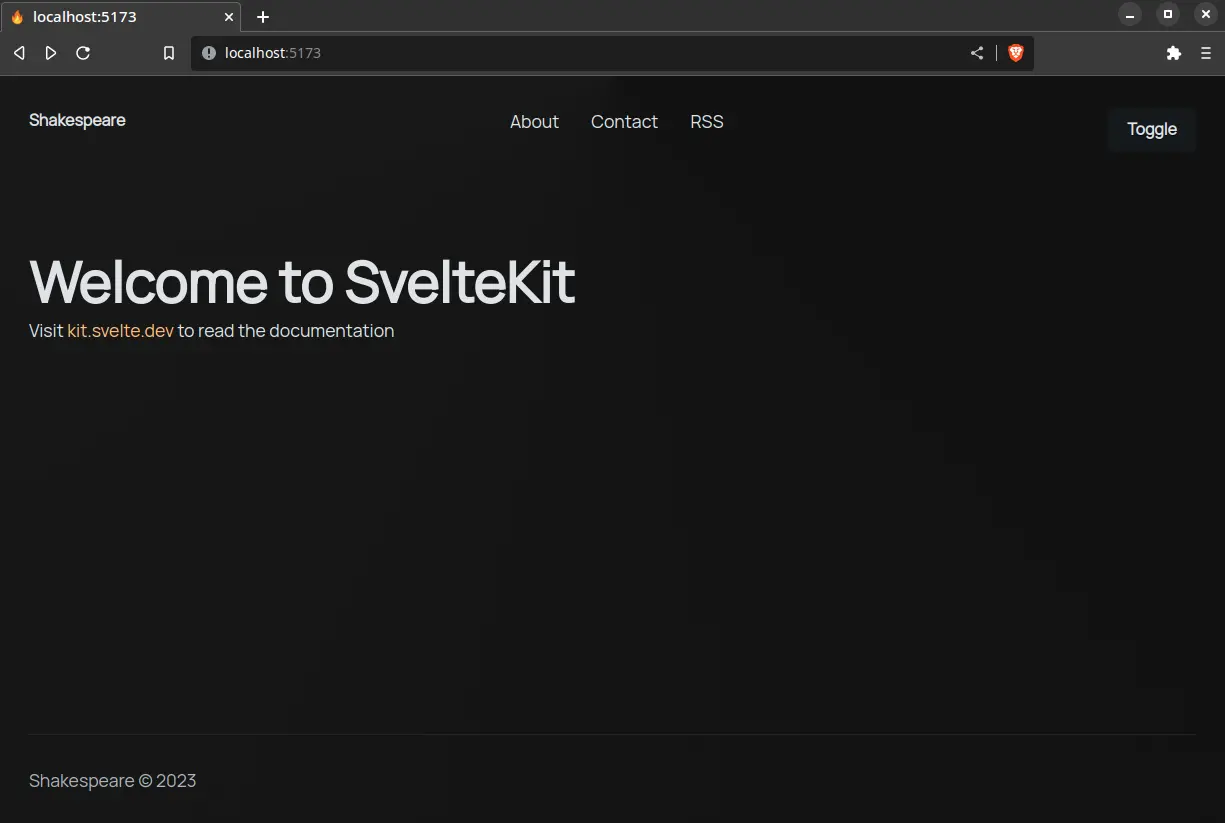
}Here’s the result:
💪 As an exercise try adding the
/aboutand/contactroutes yourself since they’re mostly used as placeholders.
This sets us up nicely for implementing a theme switcher later. Even without a theme toggle it should respect the user preference thanks to the prefers-color-scheme media query.
Setting Up Mdsvex
mdsvex is a Markdown preprocessor for Svelte that also lets you have interactive Svelte components inside Markdown like MDX for React.
To get started install mdsvex:
npm i -D mdsvexAdd mdsvex as a preprocessor inside svelte.config.js:
import adapter from '@sveltejs/adapter-auto'
import { vitePreprocess } from '@sveltejs/vite-plugin-svelte'

import { mdsvex } from 'mdsvex'

/** @type {import('mdsvex').MdsvexOptions} */
const mdsvexOptions = {
	extensions: ['.md'],
}

/** @type {import('@sveltejs/kit').Config} */
const config = {
	extensions: ['.svelte', '.md'],
	preprocess: [vitePreprocess(), mdsvex(mdsvexOptions)],
	kit: {
		adapter: adapter()
	}
}

export default config
Svelte by default processes .svelte files, but adding .md to extensions inside config lets you treat +page.md as Svelte components.
Let’s add some posts in /src/posts:
---
title: First post
description: First post.
date: '2023-4-14'
categories:
  - sveltekit
  - svelte
published: true
---

## Markdown

Hey friends! 👋

```ts
function greet(name: string) {
	console.log(`Hey ${name}! 👋`)
}
```---
title: Second
description: Second post.
date: '2023-4-16'
categories:
- sveltekit
- svelte
published: true
---
## Svelte
Media inside the **static** folder is served from `/`.
Posts API Endpoint
Let’s create an endpoint for the posts in routes/api/posts/+server.ts so it can be used anywhere in the app:
import { json } from '@sveltejs/kit'
import type { Post } from '$lib/types'

async function getPosts() {
	let posts: Post[] = []

	const paths = import.meta.glob('/src/posts/*.md', { eager: true })

	for (const path in paths) {
		const file = paths[path]
		const slug = path.split('/').at(-1)?.replace('.md', '')

		if (file && typeof file === 'object' && 'metadata' in file && slug) {
			const metadata = file.metadata as Omit<Post, 'slug'>
			const post = { ...metadata, slug } satisfies Post
			post.published && posts.push(post)
		}
	}

	posts = posts.sort((first, second) =>
    new Date(second.date).getTime() - new Date(first.date).getTime()
	)

	return posts
}

export async function GET() {
	const posts = await getPosts()
	return json(posts)
}
Here’s the breakdown:
import.meta.globis a useful Vite feature to get all the posts using a glob (eagerreads the contents of the file avoidingawait paths[path]())- Loop over the
pathsand get the slugpost.mdbut replace.mdsince we only want the slug - Check if
filehas ametadataproperty inside of it and if theslugexists to be safe and then I’m going to get themetadataor frontmatter from the post - Create a
postthat includesmetadataand theslug - Only add the post if
publishedis set totrue - Sort
postsby date and return them
If you’re using TypeScript, here are the types:
export type Categories = 'sveltekit' | 'svelte'

export type Post = {
	title: string
	slug: string
	description: string
	date: string
	categories: Categories[]
	published: boolean
}
You can navigate to http://localhost:5173/api/posts to see the JSON response:
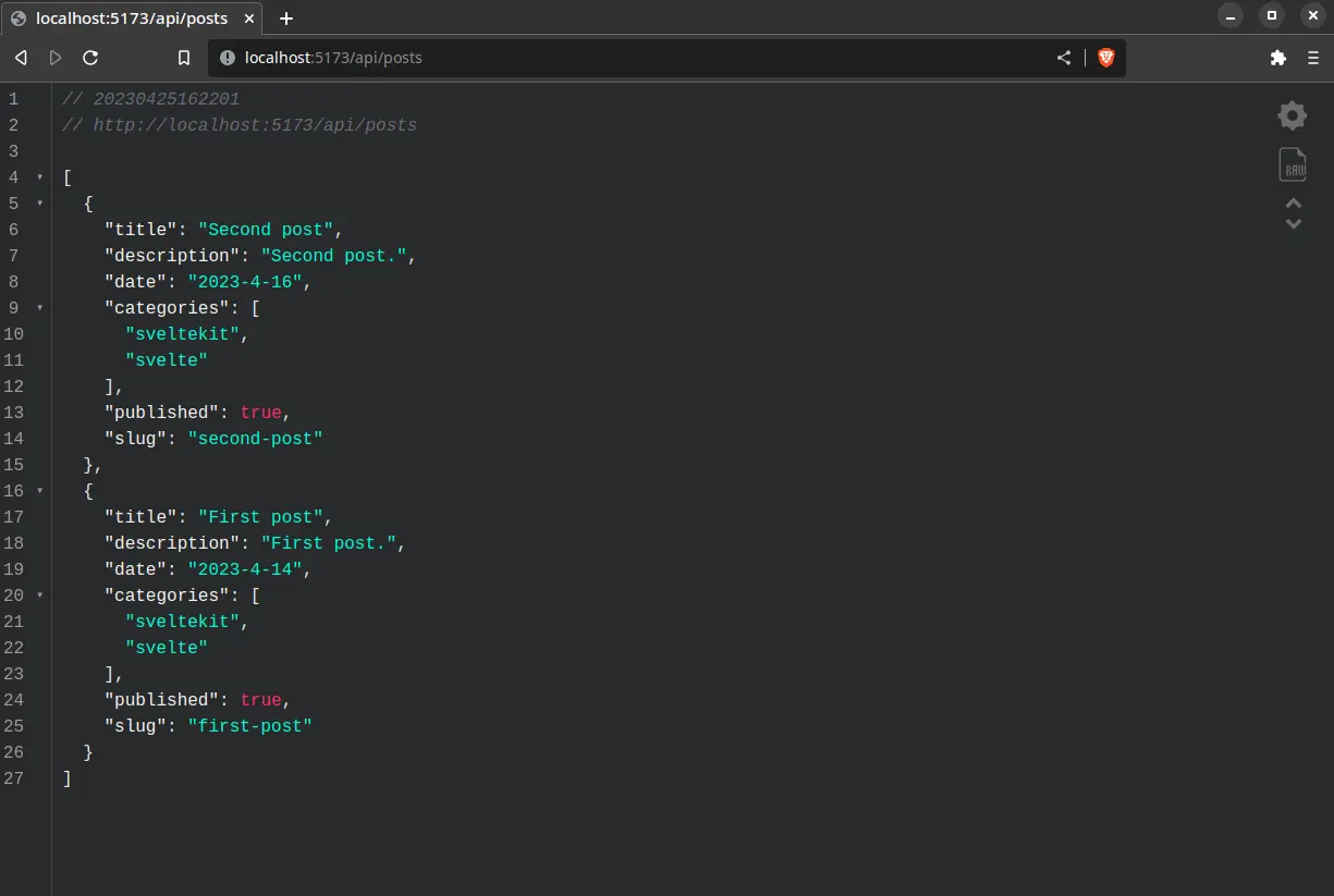
🐿️ You can use the JSON Viewer Chrome extension for the highlighting.
Awesome! 🥳
You created an API for posts you can reuse across your app or make it public for others to consume.
Rendering The Posts
Time to use the posts API you just created to fetch and server-side render the posts for the page:
import type { Post } from '$lib/types'

export async function load({ fetch }) {
	const response = await fetch('/api/posts')
	const posts: Post[] = await response.json()
	return { posts }
}
🐿️ The
fetchfunction fromloadhas superpowers like being able to resolve the relative URL/api/postswhich would not work using regularfetch.
You can now get the data and render the posts:
<script lang="ts">
	import { formatDate } from '$lib/utils'
	import * as config from '$lib/config'

	let { data } = $props()
</script>

<svelte:head>
	<title>{config.title}</title>
</svelte:head>

<section>
	<ul class="posts">
		{#each data.posts as post}
			<li class="post">
				<a href={post.slug} class="title">{post.title}</a>
				<p class="date">{formatDate(post.date)}</p>
				<p class="description">{post.description}</p>
			</li>
		{/each}
	</ul>
</section>

<style>
	.posts {
		display: grid;
		gap: var(--size-7);

		.post {
			max-inline-size: var(--size-content-3);

			&:not(:last-child) {
				border-bottom: 1px solid var(--border);
				padding-bottom: var(--size-7);
			}

			.title {
				font-size: var(--font-size-fluid-3);
				text-transform: capitalize;
			}

			.date {
				color: var(--text-2);
			}

			.description {
				margin-top: var(--size-3);
			}
		}
	}
</style>
Here’s the function used to format the date:
type DateStyle = Intl.DateTimeFormatOptions['dateStyle']

export function formatDate(date: string, dateStyle: DateStyle = 'medium', locales = 'en') {
	// Safari is mad about dashes in the date
	const dateToFormat = new Date(date.replaceAll('-', '/'))
	const dateFormatter = new Intl.DateTimeFormat(locales, { dateStyle })
	return dateFormatter.format(dateToFormat)
}
Let’s take a look at the result:
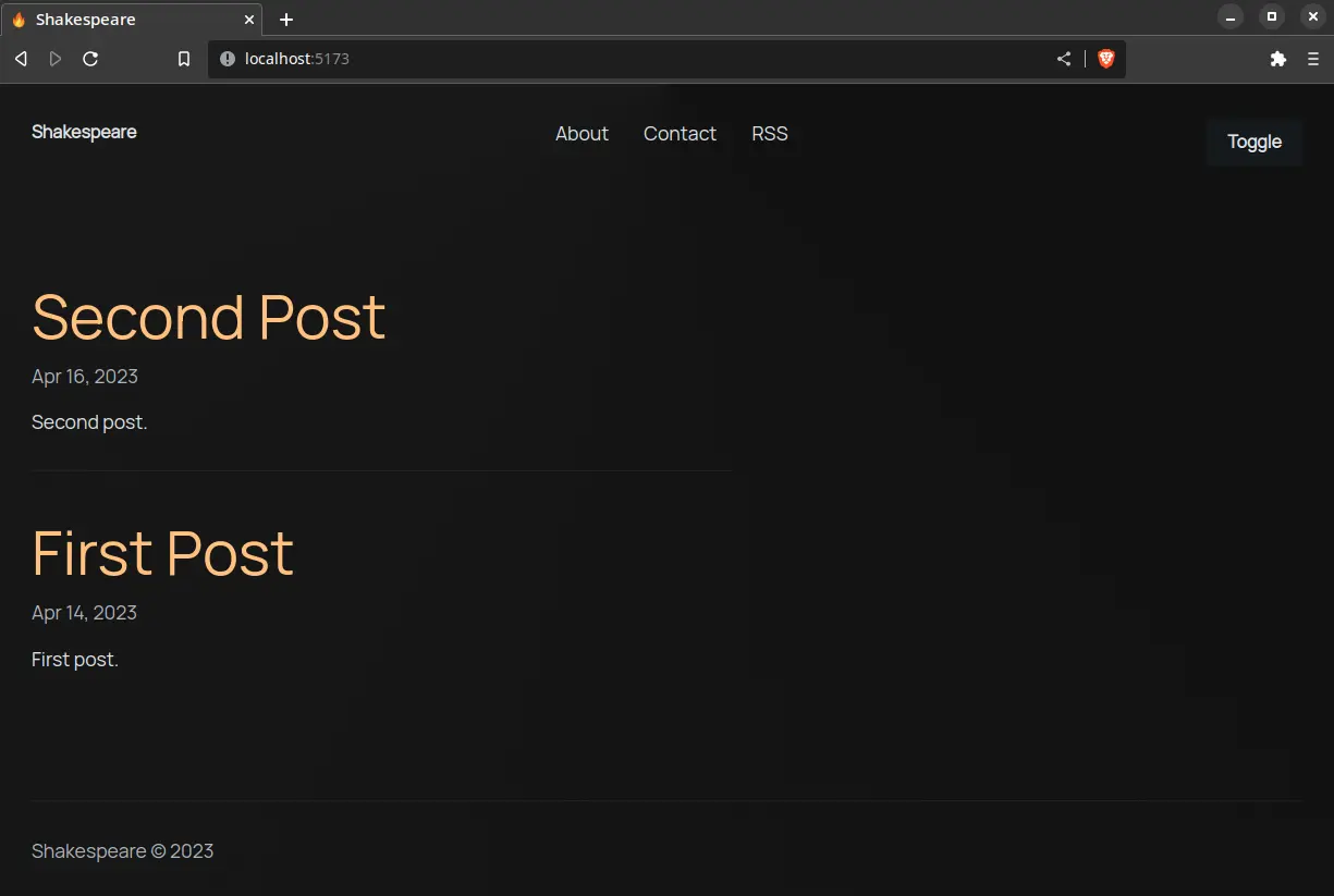
Things are coming together. 💪
Rendering A Single Post
Creating a route for every post would be annoying, so I’m going to use a dynamic route like routes/[slug]/+page.svelte that’s going to slurp up the post based on the [slug] in the URL.
Let’s use a dynamic import for the post and get the content and metadata data for the component:
import { error } from '@sveltejs/kit'

export async function load({ params }) {
	try {
		const post = await import(`../../posts/${params.slug}.md`)

		return {
			content: post.default,
			meta: post.metadata
		}
	} catch (e) {
		error(404, `Could not find ${params.slug}`)
	}
}
This lets us render data.content as a Svelte component:
<script lang="ts">
import { formatDate } from '$lib/utils'
let { data } = $props()
</script>
<svelte:head>
<title>{data.meta.title}</title>
<meta property="og:type" content="article" />
<meta property="og:title" content={data.meta.title} />
</svelte:head>
<article>
<hgroup>
<h1>{data.meta.title}</h1>
<p>Published at {formatDate(data.meta.date)}</p>
</hgroup>
<div class="tags">
{#each data.meta.categories as category}
<span class="surface-4">#{category}</span>
{/each}
</div>
<div class="prose">
<data.content />
</div>
</article>
<style>
article {
max-inline-size: var(--size-content-3);
margin-inline: auto;
h1 {
text-transform: capitalize;
}
h1 + p {
margin-top: var(--size-2);
color: var(--text-2);
}
.tags {
display: flex;
gap: var(--size-3);
margin-top: var(--size-7);
> * {
padding: var(--size-2) var(--size-3);
border-radius: var(--radius-round);
}
}
}
</style>Let’s add some global styles for the post inside app.css since we don’t have control over the markup:
/* ... */
.prose {
p {
:not(:is(h2, h3, h4, h5, h6) + p) {
margin-top: var(--size-7);
}
/* ignore paragraph tag around images */
&:has(img) {
display: contents;
}
}
:is(h2, h3, h4, h5, h6) {
margin-top: var(--size-8);
margin-bottom: var(--size-3);
}
:is(ul, ol) {
list-style-type: '🔥';
padding-left: var(--size-5);
}
:is(ul, ol) li {
margin-block: var(--size-2);
padding-inline-start: var(--size-2);
}
pre {
max-inline-size: 100%;
padding: var(--size-3);
border-radius: 8px;
tab-size: 2;
}
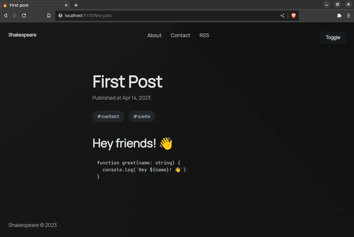
}Everything looks great:
💪 Turn the tags into links that point to a
/category/[category]page that shows the posts based on the name of the category.
Syntax Highlighting
You can use a Prism theme, but I want to use a modern syntax highlighter like Shiki that uses the same highlighter as VS Code.
Let’s install Shiki:
npm i shikiCreate a custom Shiki highlighter:
// ...
import { mdsvex, escapeSvelte } from 'mdsvex'
import { createHighlighter } from 'shiki'

/** @type {import('mdsvex').MdsvexOptions} */
const mdsvexOptions = {
	extensions: ['.md'],
	highlight: {
		highlighter: async (code, lang = 'text') => {
			const highlighter = await createHighlighter({
				themes: ['poimandres'],
				langs: ['javascript', 'typescript']
			})
			await highlighter.loadLanguage('javascript', 'typescript')
			const html = escapeSvelte(highlighter.codeToHtml(code, { lang, theme: 'poimandres' }))
			return `{@html \`${html}\` }`
		}
	},
}

// ...
Here’s the breakdown:
- Create the highlighter using
createHighlighterand pass one of the VS Code themes you want (you can also give it a path to your theme) - Use
escapeSvelteto escape characters like{that are going to cause a problem in Svelte - Shiki is going to generate HTML that looks like your code in VS Code using the
codeandlangyou passed - Insert
{@html html}in the Svelte component to output the code block, but we need to escape the backticks with\
I found this solution from a GitHub issue in the mdsvex repo.
Using Components Inside Markdown
You can use Svelte components inside Markdown from interactive data visualizations to working code examples:
<script lang="ts">
	let count = $state(0)

	const increment = () => count++
</script>

<button onclick={increment}>
	{count}
</button><!-- ... -->
<script>
import Counter from './counter.svelte'
</script>
## Counter
The counter is rendered inside Markdown.
<Counter />You can also replace HTML elements with custom components in mdsvex. For example you might want to lazy load images using loading="lazy" since you can’t set attributes on images inside Markdown.
Let’s create a default mdsvex layout that’s going to wrap everything and name it mdsvex.svelte to avoid confusion with +layout.svelte:
/** @type {import('mdsvex').MdsvexOptions} */
const mdsvexOptions = {
	extensions: ['.md'],
	layout: {
		_: './src/mdsvex.svelte'
	},
	// ...
}
The custom component receives the attributes of the element you want to replace like src and alt as props:
<script lang="ts">
	type Props = {
		src: string
		alt: string
	}

	let { src, alt }: Props = $props()
</script>

<img {src} {alt} loading="lazy" />
Let’s export everything from index.ts:
import img from './img.svelte'

export { img }
Inside the layout you have to import and export the custom component with the same name as the element you want to replace:
<script lang="ts" module>
	import { img } from '$lib/components/custom'
	export { img }
</script>

<script lang="ts">
	let props = $props()
</script>

{@render props.children?.()}
Images and other media should be placed inside the static folder at the root of your project.
Using Markdown Plugins
mdsvex first parses the Markdown into a Markdown tree (MDAST) where remark plugins run and then it converts it into a HTML tree (HAST) where rehype plugins run.
You don’t have to understand ASTs but I recommend reading How to Modify Nodes in an Abstract Syntax Tree if you want to learn the fundamentals and write your own plugin which is just a JavaScript function.
You can use rehype plugins to transform HTML and remark plugins for transforming Markdown — I’m going to refer to them as Markdown plugins even if they’re general plugins for transforming HTML and Markdown.
Using these plugins it’s very simple to extend the functionality of your Markdown blog:
rehype-slugis used to add slugs to headings like<h2 id="section">and link to a section of your post likeexample.com/post#sectionremark-tocis used to generate a table of contents based on the headings
Install the Markdown plugins:
npm i remark-toc rehype-slugAdd the plugins to the config:
// ...
import remarkToc from 'remark-toc'
import rehypeSlug from 'rehype-slug'

/** @type {import('mdsvex').MdsvexOptions} */
const mdsvexOptions = {
	// ...
	remarkPlugins: [[remarkToc, { tight: true }]],
	rehypePlugins: [rehypeSlug]
}
🐿️ You can pass options for the plugin like
[plugin, { options }]which you can find in their docs.
That’s how you stay plugged in. 🔌
Light And Dark Mode Toggle
I want to check if the user has set a theme in localStorage before the page loads to prevent flashing and set the attribute on <html> based on their preference otherwise default to using a dark theme.
A good place to start is inside app.html since it loads first:
<!doctype html>
<html lang="en">
	<head>
		<!-- ... -->
		<script type="module">
			const theme = localStorage.getItem('color-scheme')

			theme
				? document.documentElement.setAttribute('color-scheme', theme)
				: localStorage.setItem('color-scheme', 'dark')
		</script>
	</head>
	<!-- ... -->
</html>
Let’s create a simple theme toggle:
import { browser } from '$app/environment'

class Theme {
	current = $state(browser && localStorage.getItem('color-scheme'))

	toggle = () => {
		const theme = this.current === 'dark' ? 'light' : 'dark'
		document.documentElement.setAttribute('color-scheme', theme)
		localStorage.setItem('color-scheme', theme)
		this.current = theme
	}
}

export const theme = new Theme()
💪 Use JavaScript to check the user preference with
const preference = window.matchMedia('(prefers-color-scheme: dark)').matchesand then use an event listenerpreference.addEventListener('change', (mediaQuery) => ...)to update the theme.
Let’s create a <Toggle> component:
<script lang="ts">
	import { fly } from 'svelte/transition'
	import { Moon, Sun } from 'lucide-svelte'
	import { theme } from '$lib/theme.svelte'
</script>

<button on:click={theme.toggle} aria-label="Toggle theme">
	{#if theme.current === 'dark'}
		<div in:fly={{ y: 10 }}>
			<Sun />
			<span>Light</span>
		</div>
	{:else}
		<div in:fly={{ y: -10 }}>
			<Moon />
			<span>Dark</span>
		</div>
	{/if}
</button>

<style>
	button {
		padding: 0;
		font-weight: inherit;
		background: none;
		border: none;
		box-shadow: none;
		overflow: hidden;

		> * {
			display: flex;
			gap: var(--size-2);
		}
	}
</style>
Import the <Toggle> component inside the <Header> component:
<script lang="ts">
	import Toggle from './toggle.svelte'
	// ...
</script>

<nav>
	<!-- ... -->
	<Toggle />
</nav>
I wear my sunglasses at night. 😎
Page Transitions
To transition a page we need to know when the URL changed to destroy and recreate the page which is going to play the transition:
export async function load({ url }) {
	return {
		url: url.pathname
	}
}<script lang="ts">
import type { Snippet } from 'svelte'
import { fade } from 'svelte/transition'
type Props = {
children: Snippet
url: string
}
let { children, url }: Props = $props()
</script>
{#key url}
<div class="transition" in:fade>
{@render children?.()}
</div>
{/key}
<style>
.transition {
height: 100%;
}
</style><script lang="ts">
import Footer from './footer.svelte'
import Header from './header.svelte'
import PageTransition from './transition.svelte'
// ...
let { children, data } = $props()
</script>
<div class="layout">
<Header />
<main>
<PageTransition url={data.url}>
{@render children?.()}
</PageTransition>
</main>
<Footer />
</div>He’s a smooth operator. 🎷
RSS Feed
Creating an RSS feed in SvelteKit is simple as creating an API endpoint that returns XML:
import * as config from '$lib/config'
import type { Post } from '$lib/types'

export async function GET({ fetch }) {
	const response = await fetch('/api/posts')
	const posts: Post[] = await response.json()

	const headers = { 'Content-Type': 'application/xml' }

	const xml = `
		<rss xmlns:atom="http://www.w3.org/2005/Atom" version="2.0">
			<channel>
				<title>${config.title}</title>
				<description>${config.description}</description>
				<link>${config.url}</link>
				<atom:link href="${config.url}/rss.xml" rel="self" type="application/rss+xml"/>
				${posts
					.map(
						(post) => `
						<item>
							<title>${post.title}</title>
							<description>${post.description}</description>
							<link>${config.url}/${post.slug}</link>
							<guid isPermaLink="true">${config.url}/${post.slug}</guid>
							<pubDate>${new Date(post.date).toUTCString()}</pubDate>
						</item>
					`
					)
					.join('')}
			</channel>
		</rss>
	`.trim()

	return new Response(xml, { headers })
}
🐿️ The endpoint extensions like
.xmland.jsonare optional unless you use prerendering and have clashing route names.
This is the least XML required for an RSS feed which you can validate with W3C Feed Validation Service when you deploy the site.
You can include this markup in app.html so when people input your website URL in their RSS reader it’s going to pick it up:
<!DOCTYPE html>
<html lang="en">
	<head>
		<link rel="alternate" type="application/atom+xml" href="/rss.xml" />
		<!-- ... -->
	</head>
	<!-- ... -->
</html>
Custom Error Page
Let’s customize the default error page by creating +error.svelte in routes:
<script>
	import { page } from '$app/stores'
</script>

<div class="error">
	<h1>{$page.status}: {$page.error?.message}</h1>
</div>

<style>
	.error {
		height: 100%;
		display: grid;
		place-content: center;
	}
</style>
Deployment
I’m going to prerender everything so it’s blazingly fast and deploy the blog to Vercel since they have a generous free tier. 🔥
Prerendering means creating the HTML files at build time (when you run npm run build or vite build).
This is one line of code:
export const prerender = true
// ...
Let’s also prerender the RSS feed:
export const prerender = true
// ...
SvelteKit is going to crawl the links in your site and prerender the pages (+page.svelte) and server routes (+server.ts) when you use the prerender page option in the root layout.
⚠️ If you have pages with form actions they can’t be prerendered because you need a server but SvelteKit is flexible and you can disable prerendering for that page.
I’m going to use the Vercel adapter for deployment:
# remove the default adapter
npm remove @sveltejs/adapter-auto

# add Vercel adapter
npm i -D @sveltejs/adapter-vercelimport adapter from '@sveltejs/adapter-vercel'
// ...🐿️ You can run
npm run buildandnpm run previewto check for any obvious errors instead of finding out about it during deployment. The build command is going to create a.vercelfolder which should be added to your.gitignorefile.
Create a new project on GitHub and push the code:
# initialize Git repository
git init

# stage changes for every file
git add .

# add commit
git commit -m "Add project"

# add remote repository
git remote add origin https://github.com/you/sveltekit-blog.git

# rename current branch to main
git branch -M main

# push the main branch to origin
git push -u origin main
Add a new project on Vercel and import your repository. You can leave the default options and press deploy which should take a minute.
🐿️ You can change the name of the URL Vercel assigned to your project if you go to Settings > Domains.
Each time you push to the GitHub repository, Vercel is going to redeploy and run the build since it’s integrated with GitHub.
Congrats! 🎉