Svelte Headless UI Component Library
Published Apr 29, 2022
Table of Contents
- What is a headless UI component library?
- HTML is Hard
- Regular Boring Select Menus
- Custom Select Menu With Svelte Headless UI
What is a headless UI component library?
At the end of this post you’re going to learn how to make a custom <select> menu using the Svelte Headless UI component library.
You might be used to using a component library like Material UI or any other which is great if you enjoy it but you can find yourself fighting against its opinions.
A headless UI component library on the other hand doesn’t have opinions — meaning it’s completely unstyled giving you complete control not only over styles but how you compose components by only exposing the logic to you like lego pieces.
Svelte Headless UI is an unofficial port of the Headless UI for Tailwind CSS component library. It works great with Tailwind but it’s optional - in fact I don’t use Tailwind in Svelte projects because I prefer to write regular CSS when I can which is harder to do using React.
Svelte Headless UI has 9 components including Dialog, Disclosure, Listbox, Menu, Popover, Radio Group, Switch, Tabs and Transition.
Shout-out to Ryan Gossiaux for making this project.
A major benefit of using any component library is that it takes care of accesibility for you and Svelte Headless UI is no exception and is also fully typed with TypeScript and compatible with SvelteKit.
If you worked with React you might have heard about Reach UI which is also great.
HTML is Hard
I’m not joking! Have you ever tried to style a HTML <select> element? What you quickly realize is that you have to make your own custom element.
Not a problem, right? Just some simple HTML, CSS and JavaScript.
Wrong.
What most people don’t realize about HTML is the hidden complexity of accessibility. To implement a custom HTML <select> element that is also accessible you have to follow the WAI-ARIA standards guideliness.
🐿️ WAI-ARIA, the Accessible Rich Internet Applications Suite, defines a way to make Web content and Web applications more accessible to people with disabilities.
If you want to make a custom <select> menu yourself you can but you don’t want to spend hours reading WAI-ARIA practices on making a listbox.
This is what component libraries take care of for us and when I need something simpler and don’t want to reinvent the wheel I reach for a headless UI solution.
Regular Boring Select Menus
Let’s look at a regular boring <select> menu inside Svelte that holds some shows a user can select.
select.svelte
<script lang="ts">
	const shows = [
		{ id: 1, name: 'Cowboy Bebop', completed: false },
		{ id: 2, name: 'Naruto', completed: false },
		{ id: 3, name: 'One Piece', completed: false },
		{ id: 4, name: 'Fullmetal Alchemist', completed: true },
		{ id: 5, name: 'One Punch Man', completed: true },
		{ id: 6, name: 'Death Note', completed: true }
	]

	let selected = shows[0].name
</script>

<h4>Select</h4>

<select bind:value={selected}>
	{#each shows as anime (anime.id)}
		<option value={anime.name} disabled={anime.completed}>
			{anime.name}
		</option>
	{/each}
</select>

<style>
	select {
		font-size: inherit;
		font-family: inherit;
		padding: 0.4rem;
	}
</style>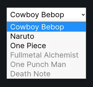
There’s nothing remarkable about the regular HTML <select> element besides how impossible it is to add custom styles.
You can put a fresh coat of paint on it maybe but you don’t have control of anything else.
Custom Select Menu With Svelte Headless UI
Let me show you how simple it is to make a custom <select> menu using the <Listbox> component and transitions with Svelte transitions.
To get started install Svelte Headless UI as a development dependency inside your Svelte project.
npm i -D @rgossiaux/svelte-headlessuiLets refer to the documentation for listbox where you can also play around with the example.
It’s like playing with lego (this is what I mean by composable) and the lego blocks available to us are <Listbox>, <ListboxButton>, <ListboxOptions>, <ListboxOption> and <ListboxLabel>.
I created a listbox.svelte component for this example but it’s not important. To start add the imports, HTML markup with some classes we can use for styling.
listbox.svelte
<script lang="ts">
	import {
		Listbox,
		ListboxButton,
		ListboxOptions,
		ListboxOption
	} from '@rgossiaux/svelte-headlessui'

	const shows = [
		{ id: 1, name: 'Cowboy Bebop', completed: false },
		{ id: 2, name: 'Naruto', completed: false },
		{ id: 3, name: 'One Piece', completed: false },
		{ id: 4, name: 'Fullmetal Alchemist', completed: true },
		{ id: 5, name: 'One Punch Man', completed: true },
		{ id: 6, name: 'Death Note', completed: true }
	]

	let selected = shows[0]
</script>

<h4>Listbox</h4>

<div class="listbox">
	<Listbox
		value={selected}
		on:change={(event) => (selected = event.detail)}
	>
		<ListboxButton class="button">
			<span>{selected.name}</span>
		</ListboxButton>

		<ListboxOptions class="options">
			{#each shows as anime (anime.id)}
				<ListboxOption
					class="option"
					value={anime}
					disabled={anime.completed}
				>
					<span>{anime.name}</span>
				</ListboxOption>
			{/each}
		</ListboxOptions>
	</Listbox>
</div>
The <Listbox> component take the selected value and uses on:change to change the selected item using a custom event from event.details which you could move to a function instead.
The rest of the code I hope is self-explanatory because it’s just components you can arrange however you want. Note that we can pass the class prop to them which we can use to style it.
If you look at the output you’re going to notice it doesn’t look like much in terms of style but the logic works. I encourage you to inspect to appreciate the amount of effort that goes into something like this.
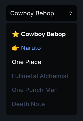
I stole the SVG for the arrows from the example in the documenation and I’m going to show you how to know the item is active or selected.
listbox.svelte
<!-- ... -->

<div class="listbox">
	<Listbox
		value={selected}
		on:change={(event) => (selected = event.detail)}
	>
		<ListboxButton class="button">
			<span>{selected.name}</span>
			<svg
				width="20"
				height="20"
				class="arrows"
				xmlns="http://www.w3.org/2000/svg"
				viewBox="0 0 20 20"
				fill="currentColor"
				aria-hidden="true"
			>
				<path
					fill-rule="evenodd"
					d="M10 3a1 1 0 01.707.293l3 3a1 1 0 01-1.414 1.414L10 5.414 7.707 7.707a1 1 0 01-1.414-1.414l3-3A1 1 0 0110 3zm-3.707 9.293a1 1 0 011.414 0L10 14.586l2.293-2.293a1 1 0 011.414 1.414l-3 3a1 1 0 01-1.414 0l-3-3a1 1 0 010-1.414z"
					clip-rule="evenodd"
				/>
			</svg>
		</ListboxButton>

		<ListboxOptions class="options">
			{#each shows as anime (anime.id)}
				<ListboxOption
					class="option"
					value={anime}
					disabled={anime.completed}
					let:active
					let:selected
				>
					<span class:active class:selected>{anime.name}</span>
				</ListboxOption>
			{/each}
		</ListboxOptions>
	</Listbox>
</div>
It’s just regular HTML at the end of the day so let’s style it.
listbox.svelte
<!-- ... -->

<style>
	.listbox {
		max-width: 280px;
		position: relative;
		font-weight: 500;
		color: hsl(220 20% 98%);
	}

	.listbox :global(.button) {
		width: 100%;
		display: flex;
		justify-content: space-between;
		align-items: center;
		padding: 1rem;
		font-family: inherit;
		font-size: inherit;
		color: inherit;
		background-color: hsl(220 20% 2%);
		border: none;
		border-radius: 10px;
	}

	.listbox :global(.arrows) {
		width: 20px;
		height: 20px;
		display: block;
	}

	.listbox :global(.options) {
		position: absolute;
		top: 44px;
		right: 0;
		left: 0;
		padding: 1rem;
		background-color: hsl(220 20% 4%);
		border-radius: 10px;
		list-style: none;
	}

	.listbox :global(.option) {
		padding: 0.8rem 0.4rem;
		cursor: pointer;
	}

	.listbox :global(.option[aria-disabled='true']) {
		color: hsl(220 20% 30%);
	}

	.listbox :global(.active) {
		color: hsl(220 80% 70%);
	}

	.listbox :global(.active)::before {
		content: '👉️ ';
	}

	.listbox :global(.selected) {
		font-weight: 700;
	}

	.listbox :global(.selected)::before {
		content: '⭐️ ';
	}
</style>
The .listbox is used as the relative parent for .options that have an absolute position. I added some disabled styles and since we know when the element is active or selected we can target it and even add some fun emojis using pseudo-elements.
🐿️ The reason you have to use
:global()is because the markup is inside of a component so you can’t target it with regular CSS.
We’re almost done! Let’s just add some transitions to complete it. 🪄
You can use the <Transition> component from Svelte Headless UI if you’re using Tailwind CSS but I’m going to show you how to use Svelte transitions.
To do so we need to take control of if the <Listbox> is open or not by adding the let:open directive and then we can use a Svelte transition as normal.
listbox.svelte
<script lang="ts">
	import { fade } from 'svelte/transition'
  // ...
</script>

<h4>Listbox</h4>

<div class="listbox">
	<Listbox
		value={selected}
		on:change={(event) => (selected = event.detail)}
		let:open
	>
		<!-- ... -->

		{#if open}
			<div transition:fade={{ duration: 100 }}>
				<ListboxOptions class="options">
					{#each shows as anime (anime.id)}
						<ListboxOption
							class="option"
							value={anime}
							disabled={anime.completed}
							let:active
							let:selected
						>
							<span class:active class:selected>{anime.name}</span>
						</ListboxOption>
					{/each}
				</ListboxOptions>
			</div>
		{/if}
	</Listbox>
</div>

<!-- ... -->
That’s it! 🥳
If you’re working on a large project with more people this might not work for you if you need more components but I prefer this approach because it’s so easy to use your own design system.
Thanks for reading! 🏄️