Impossible Layout Animations With Svelte
Published Jun 16, 2023
Table of Contents
- FLIP Your Animations
- Doesn’t Svelte Already Have FLIP Animations?
- Understanding How FLIP Works
- Using The GSAP Flip Plugin
- Using FLIP To Animate CSS Grid
- Using FLIP For Page Transitions
FLIP Your Animations
There are animations that are straight up impossible using CSS alone but also expensive for performance using JavaScript.
In the example above I’m repareting the circle element which can be disorienting for the user and there’s no way to animate the change unless you’re using the View Transitions API.
🐿️ At the time of writing the View Transitions API is experimental and only available in Chrome.
The solution is to FLIP your animations which is a term coined by Paul Lewis and stands for FIRST, LAST, INVERT, PLAY.
Instead of doing expensive calculations each frame you only use JavaScript to calculate the difference between the elements you want to animate and use CSS for what it’s intended for.
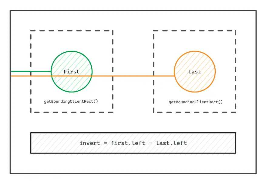
- FIRST get the initial state
- LAST get the last state
- INVERT the position of the last element to the first position using a transform for the illusion
- PLAY and animate the position of the last elements to its original position
The result of using the FLIP animation technique is a buttery smooth 60 frames per second (FPS) animation.
If this sounds complicated don’t worry because not only are you going to understand how to implement the FLIP animation technique but I’m going to show you how to use the Flip plugin from GSAP that does everything for you.
You might need to enable cookies for the example but the code is also available on GitHub.
Doesn’t Svelte Already Have FLIP Animations?
Doing FLIP animations in Svelte is possible using the flip animate directive but limited to keyed each blocks and using crossfade to complete the illusion.
It’s great for simple transitions but animating values like rotation is cursed which is not the case if you FLIP your animations.
Understanding How FLIP Works
The FLIP animation technique looks like magic but it’s simple math and you’re going to learn about getBoundingClientRect() which is one of the most useful methods in JavaScript for measuring elements in the viewport.
In the example I’m listening for clicks on the document to swap the container that holds the circle element.
<script lang="ts">
	// reference to the circle element
	let circleEl: HTMLDivElement

	function flip() {
    // ...
	}

	let swap = false
</script>

<h1>Click anywhere to FLIP</h1>

<svelte:document on:click={flip} />

<div class="container">
	<div class="parent">
		{#if !swap}
			<div bind:this={circleEl} class="circle">First</div>
		{/if}
	</div>

	<div class="parent">
		{#if swap}
			<div bind:this={circleEl} class="circle">Last</div>
		{/if}
	</div>
</div>

<style>
	h1 {
		position: absolute;
		top: 10%;
		left: 50%;
    translate: -50%;
		text-transform: capitalize;
	}

	.container {
		height: 100vh;
		display: grid;
		grid-template-columns: repeat(2, 1fr);
		place-items: center;
		cursor: pointer;
	}

	.parent {
		width: 300px;
		aspect-ratio: 1;
		display: grid;
		place-content: center;
		border: 2px dashed hsl(220 10% 40%);
		border-radius: 4px;
	}

	.circle {
		width: 100px;
		border-radius: 50%;
		aspect-ratio: 1;
		display: grid;
		place-content: center;
		color: hsl(0 0% 0%);
		background-color: aqua;
	}
</style>
You don’t have to name the function flip() but can use a more descriptive name like swapContainer().
The important part of understanding how to use FLIP is to not think about FLIP and just do the changes to the UI as usual.
<script lang="ts">
	function flip() {
    // make change
    swap = !swap
	}
</script>
After you’re done apply the FLIP animation technique.
<script lang="ts">
	function flip() {
    // get the FIRST position

    // make change
    swap = !swap

    // get the LAST position

    // PLAY from the inverted position to last
	}
</script>
I’m going to use getBoundingClientRect() to get the measurements for the elements and calculate the difference — to animate the change I’m going to use the Web Animations API.
<script lang="ts">
  function flip() {
		// get the FIRST position
		const first = circleEl.getBoundingClientRect()

		// make change
		swap = !swap

		// get the LAST position
		const last = circleEl.getBoundingClientRect()

		// INVERT position
		const invert = first.left - last.left

		// PLAY from the inverted position to last
		const animation = circleEl.animate(
			[
				{ translate: `${invert}px` },
				{ translate: '0px', background: 'yellow' },
			],
			{
				duration: 2000,
				fill: 'forwards',
				easing: 'ease-out',
			}
		)
	}
</script>
It’s not that bad, right?
That being said it’s not going to work yet because Svelte batches updates and you need to somehow wait for the DOM to update before doing the FLIP.
You can solve this problem by using the requestAnimationFrame() method or the built-in tick() lifecycle function from Svelte.
<script lang="ts">
	import { tick } from 'svelte'

	async function flip() {
		// get the FIRST position
		const first = circleEl.getBoundingClientRect()

		// make change
		swap = !swap

		// wait for DOM updates to be applied
		await tick()

		// get the LAST position
		const last = circleEl.getBoundingClientRect()

		// INVERT position
		const invert = first.left - last.left

		// PLAY from the inverted position to last
		const animation = circleEl.animate(
			[
				{ translate: `${invert}px` },
				{ translate: '0px' },
			],
			{
				duration: 2000,
				easing: 'ease-out',
			}
		)
	}
</script>
That’s it! 😄
You could also get the difference for the y-axis, scale, rotate and other properties if you need to.
You can read animating layouts with the FLIP technique by @davidkpiano to see a more advanced implementation.
I don’t know about you but I don’t want to write and maintain a FLIP library and think about edge cases, but I have good news for you because GSAP already solved that problem with the Flip plugin.
Using The GSAP Flip Plugin
If you already don’t know, GSAP is a popular JavaScript animation library with many great features such as timelines for complex animations and a lot of useful plugins.
I’m going to use the GSAP Flip plugin which makes using the FLIP animation technique easy and gives you the power of GSAP at your fingertips.
For the next example I want to animate items going from a stack of circles to a grid of squares.
This demonstrates how GSAP handles animating values like the border radius and rotations with ease.
This is the code in question before doing any animation.
<script lang="ts">
	function flip() {
		// change layout
		layout === 'grid' ? (layout = 'stack') : (layout = 'grid')
	}

	type Layout = 'stack' | 'grid'

	let layout: Layout = 'stack'
</script>

<svelte:window on:click={flip} />

<h1>Click anywhere to FLIP</h1>

<div class="container">
	<div data-layout={layout}>
		{#each { length: 10 } as _, id}
			<img
				class="circle"
				src="https://picsum.photos/100/100?random={id}"
				alt="Placeholder"
			/>
		{/each}
	</div>
</div>

<style>
	h1 {
		position: absolute;
		top: 20%;
		left: 50%;
		translate: -50%;
		text-transform: capitalize;
	}

	.container {
		height: 100vh;
		display: grid;
		place-content: center;
		cursor: pointer;
	}

	.circle {
		width: 100px;
		aspect-ratio: 1;
		border-radius: 50%;
		border: 4px solid hsl(220 10% 10%);
	}

	[data-layout='stack'] {
		display: flex;
	}

	[data-layout='stack'] .circle:not(:first-child) {
		margin-left: -40px;
	}

	[data-layout='grid'] {
		display: grid;
		grid-template-columns: repeat(5, 1fr);
		gap: 0.5rem;
	}

	[data-layout='grid'] .circle {
		border-radius: 20%;
	}
</style>
Using literal values stack and grid for the state instead of a boolean value makes it easy to style things using the data-layout attribute and makes even more sense with nesting.
Go ahead and install GSAP alongside the types if you’re using TypeScript.
npm i gsap @types/gsapBesides importing GSAP and the Flip plugin you also have to load the plugin.
<script lang="ts">
	import { tick } from 'svelte'
	import { gsap } from 'gsap/dist/gsap'
	import { Flip } from 'gsap/dist/Flip'

	gsap.registerPlugin(Flip)
	// ...
</script>
Using the FLIP animation technique with GSAP works the same way but it does everything for you.
<script lang="ts">
	import { tick } from 'svelte'
	import { gsap } from 'gsap/dist/gsap'
	import { Flip } from 'gsap/dist/Flip'

	gsap.registerPlugin(Flip)

	async function flip() {
		// get initial state
		const state = Flip.getState('.circle', { props: 'borderRadius' })

		// change layout
		layout === 'grid' ? (layout = 'stack') : (layout = 'grid')

		// wait for changes to DOM
		await tick()

		// flip
		Flip.from(state, {
			duration: 0.6,
			absolute: true,
			scale: true,
			stagger: -0.1,
			spin: true,
			ease: 'power1.easeOut',
		})
	}
</script>
You can pass a variety of options for the animation like using absolute positioning during the animation and scale for smoother animations if you have to.
🐿️ You should read the GSAP Flip documentation but in general avoid
scaleif you have text because GSAP animates the width and height by default making the text reflow in a natural way.
Using FLIP To Animate CSS Grid
In the next example I want to FLIP a CSS Grid layout.
You’re not animating CSS Grid values of course but using the FLIP animation technique to animate the transition from one state to another.
🐿️ As of late it’s possible to animate some CSS Flexbox and CSS Grid values with CSS before you reach for JavaScript.
The example uses a simple grid and uses the .details class which makes the image span two rows and two columns.
<script lang="ts">
	// selected image
	let selected = 0

	function flip(id: number) {
		// change selected image
		selected = id
	}
</script>

<div class="grid">
	{#each { length: 8 } as _, id}
		{@const details = selected === id}
		{@const number = id + 1}

		<button
			class="grid-item"
			class:details
			on:click={() => flip(id)}
		>
			<div class="title">
				<h1>Image {number}</h1>
			</div>

			<img
				src="https://picsum.photos/600/600?random={id}"
				alt="Placeholder"
			/>
		</button>
	{/each}
</div>

<style>
	.grid {
		display: grid;
		gap: 1rem;
		grid-template-columns: repeat(2, 1fr);
	}

	@media (min-width: 1024px) {
		.grid {
			grid-template-columns: repeat(3, 1fr);
		}
	}

	.grid-item {
		position: relative;
		padding: 0;
		background: none;
		border: none;
		overflow: hidden;
		cursor: pointer;
	}

	h1 {
		color: hsl(0 0% 98%);
		font-size: 2rem;
		text-transform: capitalize;
	}

	img {
		width: 100%;
		height: 100%;
		aspect-ratio: 16/9;
		display: block;
		object-fit: cover;
		border-radius: 4px;
	}

	.details {
		grid-row: span 2;
		grid-column: span 2;
	}

	.title {
		position: absolute;
		left: 20px;
		bottom: 0px;
		opacity: 0;
		translate: 0% 100%;
	}

	.details .title {
		opacity: 1;
		translate: 0%;
	}
</style>
Let’s FLIP it!
<script lang="ts">
	import { tick } from 'svelte'
	import { gsap } from 'gsap/dist/gsap'
	import { Flip } from 'gsap/dist/Flip'

	gsap.registerPlugin(Flip)

	// selected image
	let selected = 0

	async function flip(id: number) {
		// record the initial state
		const state = Flip.getState('.grid-item')

		// change selected image
		selected = id

		// wait for DOM updates
		await tick()

		// flip
		Flip.from(state, {
			duration: 0.6,
			stagger: 0.04,
			absolute: true,
		})
	}
</script>
The Flip method returns a GSAP timeline you can use to fade in the title and I’m also going to use the onStart() callback to fade out any other titles.
<script lang="ts">
	// ...
	async function flip(id: number) {
		// ...
		const tl = Flip.from(state, {
			duration: 0.6,
			stagger: 0.04,
			absolute: true,
			onStart: () => {
				// fade out
				gsap.to('.title', {
					opacity: 0,
					y: '100%',
					duration: 0.3,
				})
			},
		})
		// fade in
		tl.to('.details .title', {
			opacity: 1,
			y: 0,
			duration: 0.3
		})
	}
</script>
You can use Svelte instead of GSAP for the animation of course but “When in Rome, do as the Romans do”.
How awesome is that? 😄
Using FLIP For Page Transitions
You can also use the FLIP animation technique for page transitions. It’s similar to how you use the View Transitions API and it’s only a couple of lines of code.
For this example I have a /movies and /movies/movie/[id] route and I want to animate the cover and title from one page transition to another.
The routes have a shared layout I’m going to use to do the FLIP animation and I also need to know when the page is about to transition to measure the elements.
<script lang="ts">
	import { afterNavigate, beforeNavigate } from '$app/navigation'
	import { gsap } from 'gsap/dist/gsap'
	import { Flip } from 'gsap/dist/Flip'

	gsap.registerPlugin(Flip)

	let state: Flip.FlipState

	beforeNavigate(async () => {
		state = Flip.getState('.cover, .title')
	})

	afterNavigate(async () => {
		Flip.from(state, {
			targets: '.cover, .title',
			duration: 0.3,
			scale: true,
			ease: 'power1.easeOut',
		})
	})
</script>
There’s one new property here named targets which is required when you’re using a JavaScript framework and create and delete elements GSAP needs a reference to.
You can also query more elements than one as I’m doing for the cover and title in the example.
This won’t work yet because GSAP needs more help to understand what elements it should animate which is what the special data-flip-id attribute is for.
<script lang="ts">
	export let data
</script>

<main class="movies">
	{#each data.movies as movie}
		<article>
			<a href="/04-movies/movie/{movie.id}">
				<div class="poster">
					<img
						class="cover"
						src={movie.poster_path}
						alt={movie.title}
						data-flip-id="cover-{movie.title}"
					/>
					<span class="score">{movie.vote_average}</span>
				</div>
			</a>

			<p
				class="title"
				data-flip-id="title-{movie.title}"
			>
				{movie.title}
			</p>
		</article>
	{/each}
</main>

<!-- ... --><script lang="ts">
import { page } from '$app/stores'
export let data
$: movie = data.movies.find((movie) => movie.id === $page.params.id)
</script>
{#if movie}
<article>
<div class="poster">
<a href="/04-movies">
<img
class="cover"
src={movie.poster_path}
alt={movie.title}
data-flip-id="cover-{movie.title}"
/>
</a>
</div>
<div class="details">
<h1
class="title"
data-flip-id="title-{movie.title}"
>
{movie.title}
</h1>
<p class="overview">{movie.overview}</p>
</div>
</article>
<div class="backdrop" style:--bg-image="url({movie.backdrop_path})" />
{/if}
<!-- ... -->That’s it! 😄
You can look at the complete example on StackBlitz and find the code on GitHub.
The upcoming View Transitions API is going to enable us to create amazing native user experiences on the web without requiring JavaScript but it won’t replace the FLIP animation technique.
I hope you FLIP your animations. (╯°□°)╯︵ ┻━┻