Design For Developers
Published Nov 5, 2021
Table of Contents
- Misconception About Design
- The Four Principles of Design
- Contrast
- Repetition
- Alignment
- Proximity
- Layout
- Spacing
- Typography
- Color
- Conclusion
Misconception About Design
The greatest misconception about design is that one has to be artistic.
The purpose of design is to solve problems meaning it’s utilitarian, which is why design and development have more in common than you think.
You already know what great design is when you look at it — you just don’t know how to reason about it because you lack the required vocabulary.
I’m not going to bore you with theory but give you actual tips you can use and see a drastic improvement. I’m not a professional designer but this is what I learned through experience and learning from others.
The Four Principles of Design
The goal of design is to make things easy to understand in a aesthetically pleasing way.
Design is C.R.A.P. which stands for contrast, repetition, alignment and proximity. Remember this mnemonic and always ask yourself if your design meets C.R.A.P. standards.
A lot of design principles are based from psychology such as the gestalt principles that describe how humans group similar elements and recognize patterns.
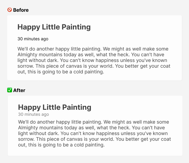
Contrast
Contrast draws attention.
You can achieve contrast through color, size of text, and shapes to make elements look different. Contrast creates visual hierarchy meaning you know what is important on the page and in what order to read information.
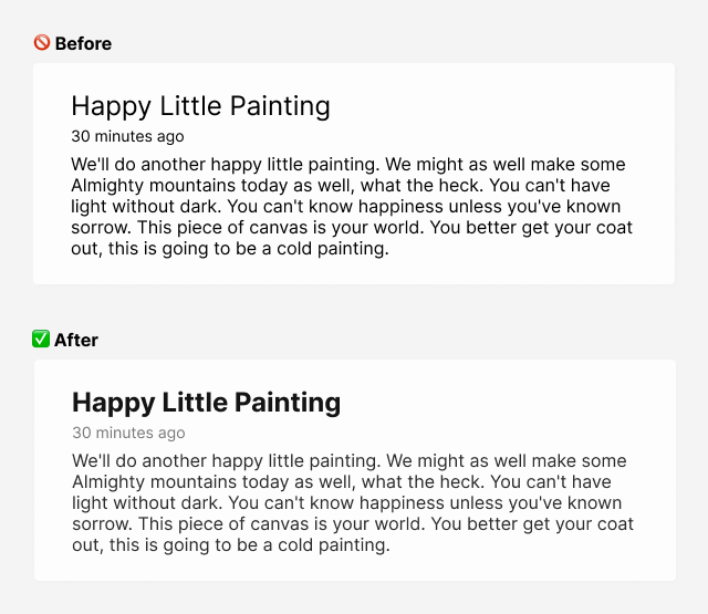
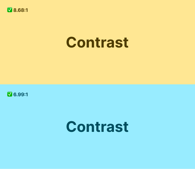
Use color to increase or reduce contrast for text that isn’t important, or reduce eyestrain.
You can use a shade of gray on a white background but don’t do the same on a colored background when you’re trying to de-emphasize text.
In that case you should pick the same background color and adjust the contrast.
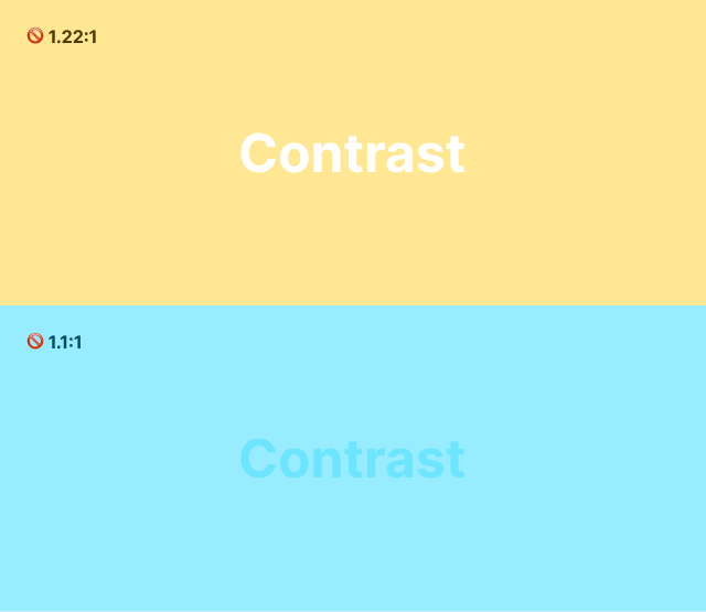
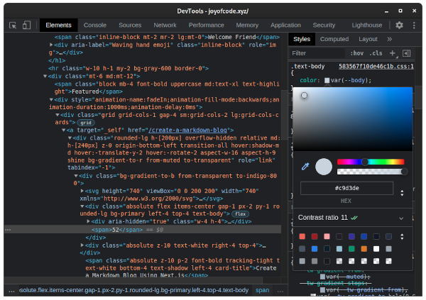
The contrast has to pass WCAG (Web Content Accessibility Guidelines), and has three levels of conformance ranging from A, AA to AAA.
Use the developer tools to check the contrast ratio.
Repetition
Repetition creates consistency in your design.
Using a consistent style for your elements creates rhythm by repeating the same font, size, and color which makes your content more readable.
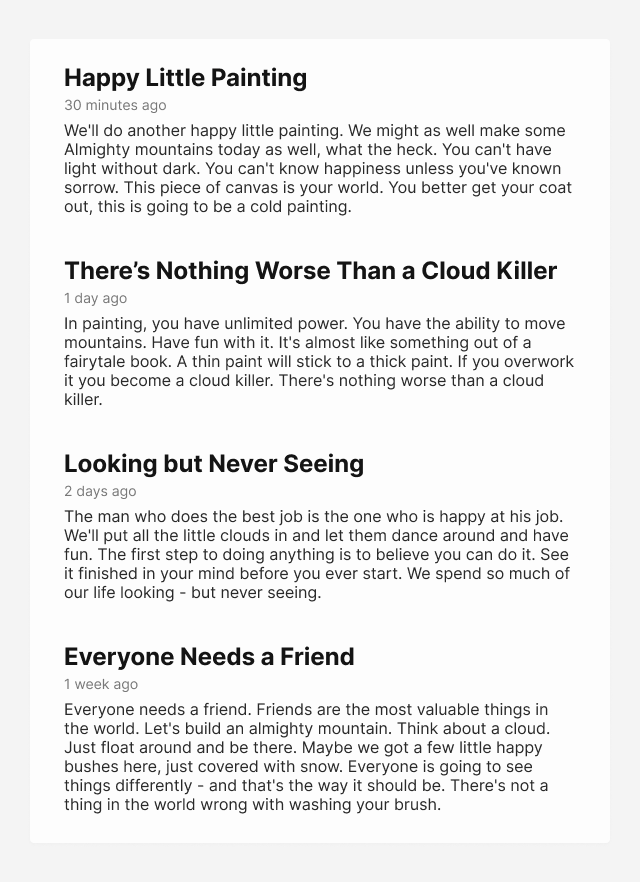
You’ve probably seen one of these landing pages that lets you know there’s more content on the page.
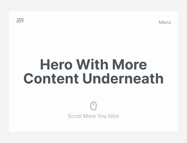
A more clever use of design would be using the line from the logo to establish repetition. If you look closely none of the elements are placed randomly but with purpose. I’m going to talk more about this in alignment.
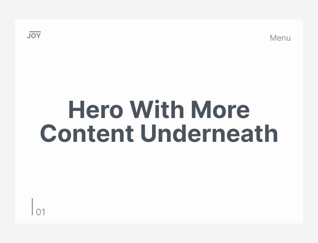
This entices the reader of your content to explore more. The number is mostly a design element, and doesn’t have to have meaning, unless you want to establish repetition by numbering every section.
The more you look at design, the more you’re going to pick up on these details.
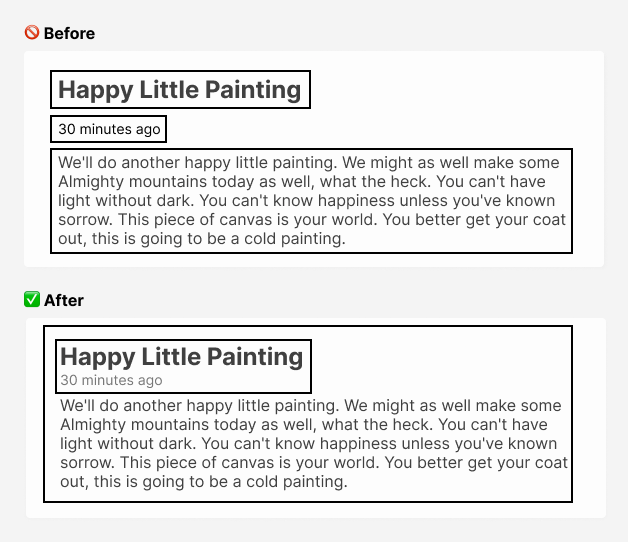
Alignment
Alignment is used to organize information creating order.
Design decisions should be intentional and not arbitrary. When elements are aligned, they visually connect to each other and serve as an anchor for your eyes through an invisible line created from alignment.
Great design is in the details.
A often mistake you can make is centering everything, and not constraining the width of the text which makes it hard to read.
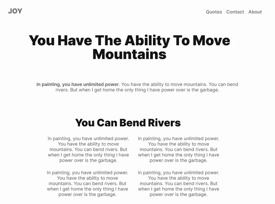
The difference is stark using only left alignment.
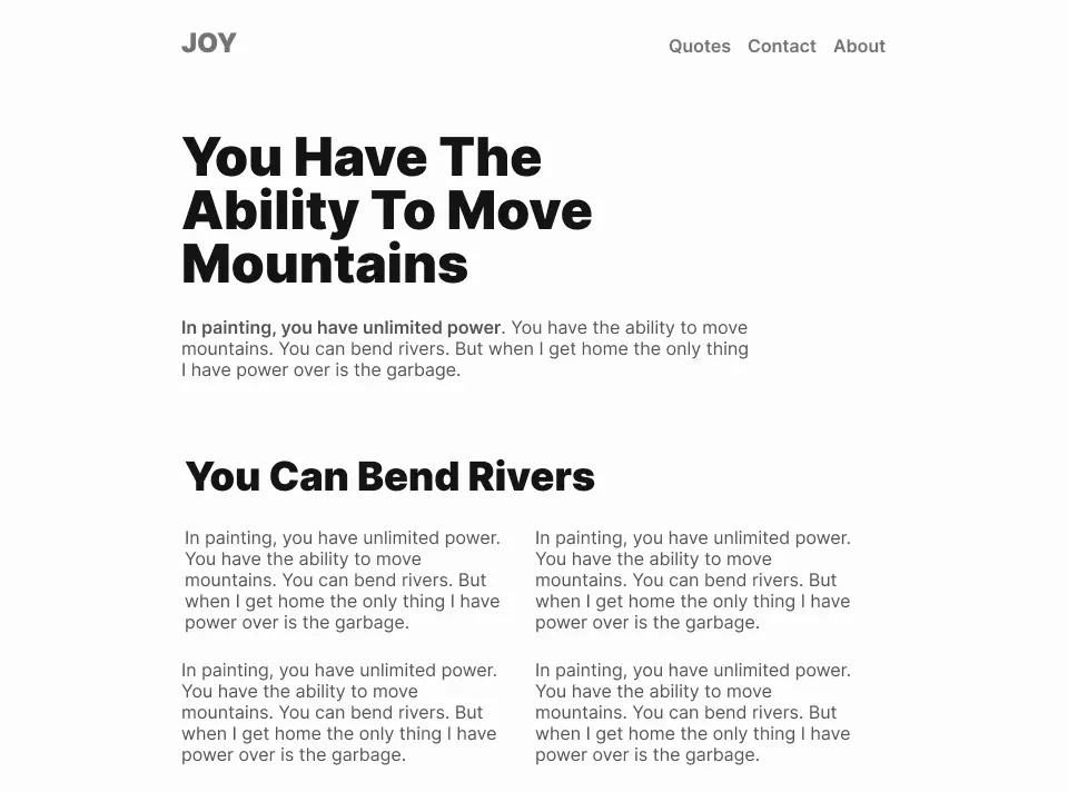
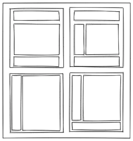
You can enable the grid in a design tool like Figma. I’m using a twelve column grid since that’s the most frequently used one.
You can use CSS grid to create the same grid for your site, making translating designs easy.
Let me show you the invisible line I mentioned earlier.
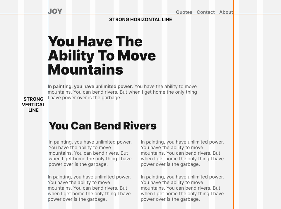
You should always have a strong horizontal or vertical line because it anchors your eye.
The alignment for the logo and navigation is also intentional being on the baseline. This isn’t to say that centering is bad — you can center short text, but long text is hard to read. I’m going to cover more on typography later.
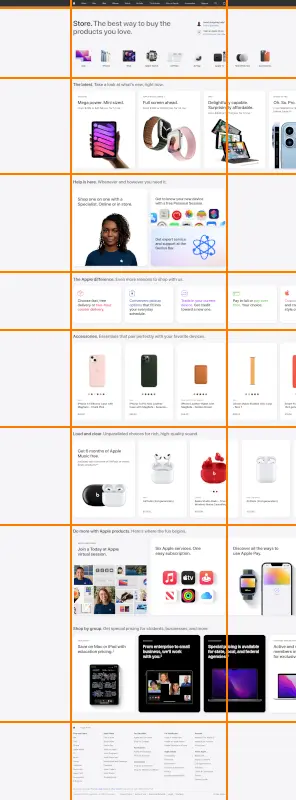
Once you learn enough design fundamentals, you can break the rules to create more interesting design. Having everything on a grid can feel rigid, and boring. To make the design more interesting, images are often used to break outside the grid, which looks great because it’s intentional.
Bad design is design that looks unintentional.
Let’s look at the design of Apple.com to see how they “break the rules”. You can observe how design is used to create interest where the products break the monotonous grid. Because the rest of the design is on a grid, and aligned perfectly it looks intentional, and not like a mistake.
Proximity
Proximity is grouping related things together.
Use proximity instead of spacing everything evenly.
Proximity lets you brain group related information together, so it appears as one visual unit instead of feeling unrelated.
Layout
Before you do anything, use a piece of paper, or a design tool to draw wireframes which are just simple boxes that represent your layout to avoid a lot of problems.
Another mistake is having your site look like it’s made out of boxes by using a different background colors for every section. Use a more subtle shade of color instead to separate the content with subtle borders.
Layout is not easily taught, and has to be practiced.
If you want to create unique designs you have to look at inspiration on sites such as Awwwards, Behance , Dribbble or Lapa and learn from recreating designs. Expose yourself to great design by using a new tab extension for your browser like Panda.
Using a grid is going to make you realize how everything in design is intentional.
This isn’t always the case because a lot of great looking design isn’t always professional design. You’re going to notice this a lot when looking at amateur design that has aesthethics, but it’s not practical.
You can take this boring landing page, and use design to add some visual interest. Do as many layout ideas as you want.
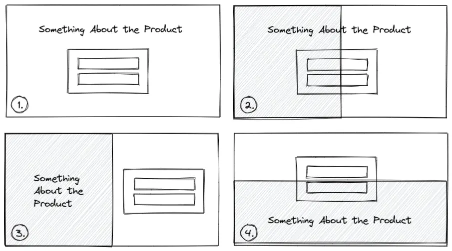
Don’t try to make it look good, but just try out random ideas.
Spacing
Great design is about consistency, and using the four principles of design to create a cohesive looking design.
Typography
Typography is important because it evokes emotion.
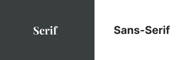
- Serif fonts have fancy decorations, which makes them popular in luxury brands, but they’re also used in print from newspapers to books
- Sans-serif fonts lack the decorations, and are more legible for large text, and modern screens
- Monospaced fonts are fonts where every character has the same width
Having great looking typography isn’t hard with a couple of rules:
- Use one of these Google Fonts: Inter, Manrope, Montserrat, Poppins
- Anything below 16 pixels and 400 for the font weight is not readable
- Use a single sans-serif font and weights for contrast
- Skip a font weight for more contrast (400, 600, 700, 900)
- Use a line height between 150-180% for text
- Don’t forget to adjust the line height for titles
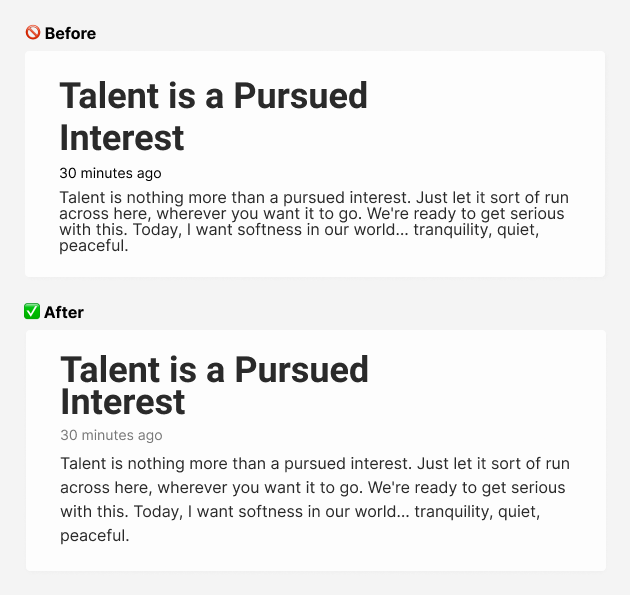
- Avoid using absolute color values like pure black and white as it’s harsh on the eyes, so use a shade instead
- Add a subtle color to text to make it feel cooler or warmer
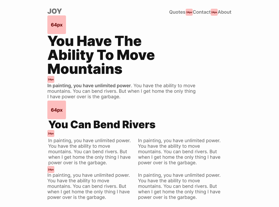
You don’t need a Fibonnaci number generator to create a typography scale. Instead use multiples of eight meaning 8px, 16px, 24px, 32px, 64px, and so on. This works great as a base unit for typography, and spacing inside a 8 point grid system.
To use a 8 point grid inside Figma, set your nudge value to 8px .
Don’t forget that you can turn these values into CSS variables for your typography and spacing for easy reuse in your project.
Even if I say “rules” don’t take any of it as gospel. These are constraints to help you create a consistent looking design, and avoid mindless pixel pushing.
The optimal reading length for text is around 60 characters but I prefer to go up to 80 characters. You can set the max-width of your content to 60ch in your CSS. One of the most important things for legible text is line height. I find a great line height to be from 150% to 180% or 1.5 to 1.8 in CSS.
Always test how your typography looks on real text, and don’t forget to adjust your title’s line height to compensate.
Color
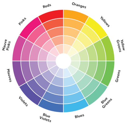
You don’t have to understand color theory.
Find a primary color you like. From there find a complementary color that works together. If you’re using black and white you’re already using two colors. You can use shades of one color for a monochromatic color scheme, so you don’t even need more colors.
To find a complementary color is simple — just pick the color opposite the primary color you picked on the color wheel.
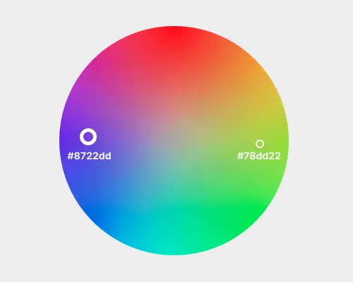
I like the color picker from Canva because it’s simple, and you can learn more about color.
You can use the 60-30-10 color rule from interior design, where 60% is the main color, 30% is the secondary color, and 10% is the accent color.
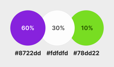
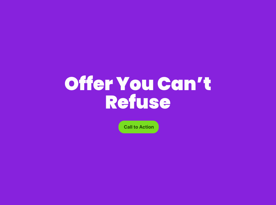
The primary color doesn’t always have to be 60%, and you can flip the values for different sections of your site.
The purple is taking around 60%, and the white is taking up 30%, while the accent color is taking up 10% of the space.
Conclusion
You learned enough visual design to be dangerous.
You also learned the vocabulary to talk about design more eloquently. If you stick to a couple of simple rules, you can be confident your design looks great.
If this ignited your passion for design I highly recommend reading Refactoring UI and Design for Hackers: Reverse Engineering Beauty.
Thanks for reading! 🏄