How to Style CSS Focus Outline
Published Mar 28, 2021
Table of Contents
- Default Styles Don’t Spark Joy
- Removing Focus Outline Is Bad For Accessibility
- Outline Doesn’t Work for Rounded Corners
- Using Border Causes Layout Shifts
- Use Box Shadow
- Conclusion
Default Styles Don’t Spark Joy
Do you ignore focus styles because they’re ugly? I’m going to explain why you shouldn’t remove them, and show you how to style them to match your UI (user interface) instead.
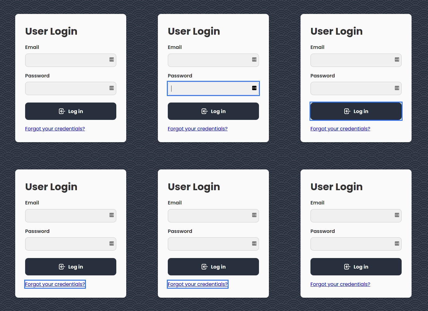
Let’s say you’re presented with the design above. If you were to just Tab through, it’s functional — but we can agree it’s not something to behold.

Removing Focus Outline Is Bad For Accessibility
You might be tempted to remove focus styles. There’s only one problem. It’s terrible for accessibility. Focus outline provides visual feedback for users who can’t use a mouse, or have visual impairment, when using Tab on their keyboard for navigation.
/* 🚫 don't do this */
:focus {
  outline: none;
}
Be mindful that impairment doesn’t only refer to people with permanent disabilities. You can have temporary impairment due to injury, so the number of people with impairments is higher than you might think.
It’s our responsibility to make the web accessible for everyone.
Outline Doesn’t Work for Rounded Corners
/* ⚠️ doesn't work for rounded corners */
:focus {
  outline: 3px solid hsla(220, 100%, 50%, 80%);
}
There is no way of specifying a border radius for outline at the moment, other than some browser specific experimental features.
Using Border Causes Layout Shifts
/* 🚫 don't do this */
:focus {
  outline: none;
  border: 3px solid hsla(220, 100%, 50%, 80%);
}
The layout shifts from the border cause our elements to jump around. It can probably be solved by setting a border on each element with no opacity, and then bring the opacity back on focus. I don’t hate this idea, but it’s not great.
Use Box Shadow
/* ✅ do this */
:focus {
  outline: none;
  box-shadow: 0 0 0 3px hsla(220, 100%, 50%, 80%);
}
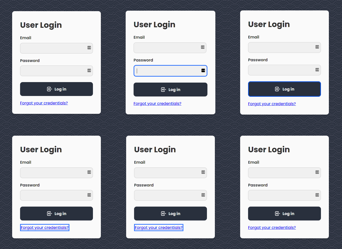
This works for any focusable element. Not only does it take on the same rounded corners, but you can control other properties such as color, opacity, offset, and blur. You can read more about box-shadow here.
Notice we’re also able to animate the transition.
.element {
  transition: box-shadow 0.3s ease;
}
Conclusion
Accessibility is important. It’s an important subject worth understanding. No one goes out of their way to create a bad user experience on purpose. If you’re aware, and strive to make the web a better place — that’s what counts.