Create Amazing User Interfaces Using Animation With Svelte
Published Sep 22, 2022
Table of Contents
- Beyond Whimsy
- Transitions
- Local Transitions
- Key Blocks
- Page Transitions
- Custom Transitions
- Deferred Transitions
- Animate
- Motion
- Using Other Animation Libraries
- Accessibility
- Conclusion
Beyond Whimsy
There’s a lack of reverence for both animation and accessibility where they’re treated as “nice to have” instead of being part of a holistic user experience but it’s not because of a lack of care but historically being hard — none of us intend to create a bad user experience on purpose.
Animations can tell stories and help the user not feel disoriented if elements on the page reflect how objects behave in the real world instead of teleporting around and help bring attention to parts of the site that require it.
In Svelte animations are a first class-citizen because Svelte was forged by @Rich_Harris in a newsroom for that purpose and is popularly used for but not limited to visual storytelling and data visualizations since then.

🧪 The code is available on GitHub or you can view the examples on StackBlitz.
I hope you’re ready to become an animation wizard and delight your users!
Transitions
A transition is triggered by an element entering or leaving the page as a result of a state change.
Svelte exposes seven transition functions fade, blur, fly, slide, scale, draw and crossfade.
You can use the same intro and outro transition with transition:fade but if you want to use different intro and outro transitions use in: and out:.
<script lang="ts">
  import { fade } from 'svelte/transition'

  let animate = false
</script>

<label>
  <input type="checkbox" bind:checked={animate} />
  Animate
</label>

{#if animate}
  <p transition:fade>
    There are no mistakes, only happy accidents.
  </p>
{/if}

<style>
  label {
    position: absolute;
    bottom: 4%;
    left: 4%;
    font-size: 1rem;
    font-weight: bold;
    text-transform: uppercase;
    letter-spacing: 1px;
  }
</style>
Each transition function accepts at least a delay, duration and easing parameter but others might accept more if you consult the documentation.
You can specify a custom easing function or use a built-in Svelte easing functions to give character to your animations — use the ease visualiser to explore different easing options.
I want to animate a title and need to split the lines which is simple using Svelte:
- First I’m going to declare the lines and use empty lines to create a pause between other text that’s going to animate in
- I’m going to use the
in:flyintro transition and set a startingyposition using the built-inbackOuteasing function - To get a stagger effect where the next element animating in is delayed you can multiply the
indexof the element by some time300msfor thedelay - I want the text to appear from the bottom of the element instead of fading in from the starting
yposition, so I setoverflow: hiddenon the parent
<script lang="ts">
  import { fly } from 'svelte/transition'
  import { backOut } from 'svelte/easing'

  const lines = [
    'the magical',
    '',
    'disappearing',
    '',
    'UI framework.',
    '🪄'
  ]

  let animate = false
</script>

<label>
  <input type="checkbox" bind:checked={animate}>
  Animate
</label>

{#if animate}
  <div class="lines">
    {#each lines as line, i}
      <div class="overflow">
        <span
          class="line"
          in:fly={{
            y: 100,
            delay: 300 * i,
            easing: backOut
          }}
        >
          {line}
        </span>
      </div>
    {/each}
  </div>
{/if}

<style lang="scss">
  .lines {
    max-width: 800px;
    font-size: 3rem;
    font-weight: 900;
    text-align: center;

    .overflow {
      display: inline-block;
      overflow: hidden;
      vertical-align: bottom;
    }

    .line {
      display: inline-block;
      margin: 0.2rem;
      text-transform: uppercase;
      text-shadow: 2px 0 10px hsl(0 0% 0% / 20%);
    }
  }
</style>
Here I’m using the animate value to play the transition but if you look at the finished examples I’m using an Animate component I made that does the same thing and gives you a replay button.
🐿️ Transitions don’t play on first render unless you set
intro: truefor Svelte components. This doesn’t work for SvelteKit but you can setanimate = truewhen the component mounts insideonMountto achieve the same result.
If you use transition:fly the transition would play in reverse when the component unmounts but if you use an intro transition in:fly you can use an outro transition out:fly which doesn’t even have to be the same transition.
🐿️ Terms such as “mount” and “unmount” refer to when the component gets created and destroyed.
You can also use transition events and other standard DOM events.
{#if animate}
  <p
    transition:fade
    on:introstart
    on:outrostart
    on:introend
    on:outroend
  >
    There are no mistakes, only happy accidents.
  </p>
{/if}
Some of the transitions are specific to certain things like draw for animating the stroke of an SVG element and we’re going to look at what crossfade is useful for later.
Here’s how you can animate an SVG of a circle with a check mark in Svelte for delightful interactions.
<script lang="ts">
  import { draw } from 'svelte/transition'

  let animate = false
</script>

<label>
  <input type="checkbox" bind:checked={animate}>
  Animate
</label>

<svg
  xmlns="http://www.w3.org/2000/svg"
  viewBox="0 0 24 24"
  width="48px"
  height="48px"
  stroke="currentColor"
  stroke-width="1.4"
  stroke-linecap="round"
  stroke-linejoin="round"
  fill="none"
>
  <path
    in:draw={{ duration: 1500 }}
    d="M22 11.08V12a10 10 0 1 1-5.93-9.14"
  />
  <polyline
    in:draw={{ duration: 2000 }}
    points="22 4 12 14.01 9 11.01"
  />
</svg>
Local Transitions
You might encounter an undesired effect when your parent element transition plays causing the children element transition to also play.
Local transitions only play when the block they belong to is created or destroyed and don’t get triggered when parent blocks are created or destroyed.
You’re not going to encounter this problem often but when you do it’s useful to know about and you only have to add the local modifier to your transition.
<script lang="ts">
  import { fade, slide } from 'svelte/transition'

  let parent = true
  let children = [1, 2]

  function add() {
    children = [...children, children.length + 1]
  }
</script>

<div class="controls">
  <label>
    <input type="checkbox" bind:checked={parent} />
    Parent
  </label>
</div>

{#if parent}
  <div class="parent" transition:fade>
    <span>Parent</span>
    {#each children as child}
      <div class="child" transition:slide|local>
        Child
      </div>
    {/each}
    <button on:click={add}>Add</button>
  </div>
{/if}

<style lang="scss">
  .controls {
    position: absolute;
    bottom: 4%;
    left: 4%;
    font-size: 1rem;
    font-weight: bold;
    text-transform: uppercase;
    letter-spacing: 1px;
  }

  .parent {
    width: 400px;
    display: grid;
    gap: 1rem;
    margin-bottom: 1rem;
    padding: 1rem;
    background-color: hsl(220 20% 24%);
    box-shadow: 0 0 10px hsl(0 0% 0% / 10%);
    border: 1px solid hsl(220 20% 28%);
    border-radius: 1rem;
    overflow: hidden;

    span {
      font-weight: 700;
      font-size: 2rem;
    }

    .child {
      padding: 1rem;
      background-color: hsl(220 20% 28%);
      box-shadow: 0 0 10px hsl(0 0% 0% / 10%);
      border: 1px solid hsl(220 20% 32%);
      border-radius: 1rem;
    }
  }
</style>
Key Blocks
Sometimes you want to play a transition whenever a value changes and the {#key ...} block exists for that purpose as key blocks destroy and recreate their contents when the value changes.
Let’s say I have notifications and I want to animate the count when it updates.
<script lang="ts">
  import { onMount } from 'svelte'
  import { scale } from 'svelte/transition'

  let notifications = 0

  onMount(() => {
    const interval = setInterval(() => notifications += 1, 2000)
    return () => clearInterval(interval)
  })
</script>

<div class="notifications">
  <div class="count">
    {#key notifications}
      <span in:scale>{notifications}</span>
    {/key}
  </div>

  <svg
    class="bell"
    xmlns="http://www.w3.org/2000/svg"
    viewBox="0 0 24 24"
    fill="none"
    stroke-width="1.5"
    stroke="currentColor"
  >
    <path
      d="M14.857 17.082a23.848 23.848 0 005.454-1.31A8.967 8.967 0 0118 9.75v-.7V9A6 6 0 006 9v.75a8.967 8.967 0 01-2.312 6.022c1.733.64 3.56 1.085 5.455 1.31m5.714 0a24.255 24.255 0 01-5.714 0m5.714 0a3 3 0 11-5.714 0"
      stroke-linecap="round"
      stroke-linejoin="round"
    />
  </svg>
</div>

<style lang="scss">
  .notifications {
    position: relative;

    .count {
      width: 48px;
      height: 48px;
      position: absolute;
      top: -10px;
      right: -10px;
      display: grid;
      place-content: center;
      padding: 2rem;
      font-size: 2rem;
      font-weight: 700;
      color: tomato;
      background-color: white;
      border-radius: 50%;
    }

    .bell {
      width: 140px;
      height: 140px;
    }
  }
</style>
Page Transitions
Because SvelteKit is the default way to build Svelte apps you might want to know how to do page transitions and it’s a great way to use what you learned so far.
To start create a <PageTransition> component that accepts a key so it knows when the page changes to play the transition and duration as the props.
<script lang="ts">
  import { slide } from 'svelte/transition'

  export let key: string
  export let duration: number = 300
</script>

{#key key}
  <div
    in:slide={{ duration, delay: duration }}
    out:slide={{ duration }}
  >
    <slot />
  </div>
{/key}

<style>
  div {
    position: absolute;
    inset: 0;
  }
</style>
To avoid overlap for the transitions we set the delay value to the duration and set the position of the element to absolute to help avoid issues but it’s optional.
Inside +layout.ts we’re going to pass the url that updates when it changes.
import type { LayoutLoad } from './$types'

export const load: LayoutLoad = ({ url }) => {
  return { url: url.pathname }
}
Inside +layout.svelte receive and pass the prop to the component.
<script lang="ts">
  import PageTransition from './transition.svelte'
  import type { PageData } from './$types'

  export let data: PageData
</script>

<PageTransition key={data.url} duration={600}>
  <slot />
</PageTransition>
Custom Transitions
The transitions you’ve seen so far cover most of what you need but sometimes you want to combine them or do something crazy and that’s where custom transitions come in.
You might be thinking how Svelte does transitions is some magic but surprisingly transitions use regular CSS with the help of JavaScript.
Here’s how Svelte implements the fade transition.
export function fade(node: Element, {
  delay = 0,
  duration = 400,
  easing = linear
  }: FadeParams = {}): TransitionConfig {
  const o = +getComputedStyle(node).opacity

  return {
    delay,
    duration,
    easing,
    css: t => `opacity: ${t * o}`
  }
}
It has a similar signature to Svelte actions but returns a css or tick function and we can use the same signature to create custom transitions.
🐿️ Svelte transitions use CSS instead of JavaScript, so they don’t cause jank because they can run separately and not block the main thread.
I have a simple modal I want to spice up when a user opens it by scaling and transforming it:
- For this I created a custom transition function
modalthat’s going to take the element and parameters and get the existingtransformstyles of the element and return acssfunction. - The
cssfunction takes atargument that’s a value between0and1after theeasingfunction has been applied and theuargument is the opposite and returns a value from1to0 - I use these values to
scaleandtranslateYthe element, so it starts to grow from-100pxon the vertical axis
🐿️ The easiest way to think about
tis that it animates TO the value you specified anduanimates FROM the value you specified — if you animatescalewithtit goes from0to1being the normal state but usinguit would go from1to0.
<script lang="ts">
  import { createEventDispatcher } from 'svelte'
  import { quintOut } from 'svelte/easing'
  import type { TransitionConfig } from 'svelte/transition'

  type ModalParams = { duration?: number }
  type Modal = (
    node: Element,
    params?: ModalParams
  ) => TransitionConfig

  const modal: Modal = (
    node,
    { duration = 300 } = {}
  ) => {
    const transform = getComputedStyle(node).transform

    return {
      duration,
      easing: quintOut,
      css: (t, u) => {
        return `transform:
          ${transform}
          scale(${t})
          translateY(${u * -100}%)
        `
      }
    }
  }

  const dispatch = createEventDispatcher()

  function closeModal() {
		dispatch('close')
	}
</script>

<div class="modal-background" on:click={closeModal} />

<div
  transition:modal={{ duration: 1000 }}
  class="modal"
  role="dialog"
  aria-modal="true"
>
  <slot />
</div>

<style lang="scss">
  .modal-background {
    width: 100%;
    height: 100%;
    position: fixed;
    top: 0;
    left: 0;
    background: hsla(0 0% 0% / 20%);
  }

  .modal {
    position: absolute;
    left: 50%;
    top: 50%;
    width: calc(100vw - 4em);
    max-width: 32em;
    max-height: calc(100vh - 4em);
    overflow: auto;
    background: hsl(220 20% 90%);
    box-shadow: 0 0 10px hsl(0 0% 0% / 10%);
    transform: translate(-50%, -50%);
    border-radius: 1rem;
  }
</style>
Time to use the best modal ever.
<script lang="ts">
  import Modal from './modal.svelte'

  let showModal = false

  const open = () => showModal = true
  const close = () => showModal = false
</script>

<button on:click={open}>Show modal 🎷</button>

{#if showModal}
  <Modal on:close={close}>
    <img
      src="https://i.giphy.com/media/Ju7l5y9osyymQ/giphy.webp"
      alt="Man is dancing"
    />
  </Modal>
{/if}

<style lang="scss">
  img {
    width: 100%;
    height: 100%;
    display: block;
  }
</style>
The Svelte documentation advises to use css when possible because of performance reasons but if you want to do something more ambitious like a typewriter effect using JavaScript you can use tick with the same arguments.
<script lang="ts">
  import type { TransitionConfig } from 'svelte/transition'

  type TypewriterParams = { speed?: number }
  type Typewriter = (
    node: Element,
    params?: TypewriterParams
  ) => TransitionConfig

  const typewriter: Typewriter = (
    node,
    { speed = 1 } = {}
  ) => {
    const text = node.textContent ?? ''
    const duration = text.length / (speed * 0.01)

    return {
      duration,
      tick: (t) => {
        const i = Math.trunc(text.length * t)
        node.textContent = text.slice(0, i)
      }
    }
  }

  let animate = false
</script>

<label>
  <input type="checkbox" bind:checked={animate}>
  Animate
</label>

{#if animate}
  <p in:typewriter class="text">
    “There are no mistakes, only happy accidents.”
  </p>
{/if}

<style lang="scss">
  .text {
    width: 100%;
    position: absolute;
    top: 20%;
    padding: 0 3rem;
    font-family: 'Special Elite', cursive;
    font-size: 3rem;
    color: hsl(220 20% 20% / 80%);
  }
</style>
Deferred Transitions
Use deferred transitions when you want to choreograph elements changing position from one parent to another to create an illusion how objects behave in the real world instead of disappearing and reappearing.
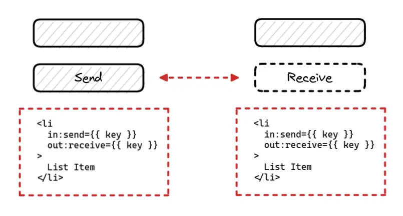
The crossfade function creates a pair of transitions called send and receive:
- When an element is “sent” it looks for a corresponding element being “received” and creates a transition that animates the element to that position and fades it out
- The reverse happens when it’s “received”
- If there is nothing to animate to the
fallbacktransition is used - You can set options for
crossfadeincludingdelay,duration,easingandfallback
I have some items I’m sending from one element to another and I want to animate that change using crossfade and provide a fallback when the item is removed.
<script lang="ts">
  import { crossfade } from 'svelte/transition'
  import { quintOut } from 'svelte/easing'
  import shuffle from 'just-shuffle'

  const [send, receive] = crossfade({
    duration: 600,
    // when you remove an element
    fallback(node) {
      const style = getComputedStyle(node)
      const transform =
        style.transform === 'none' ? '' : style.transform

      return {
        duration: 600,
        easing: quintOut,
        css: (t) => `
          opacity: ${t}
          transform: ${transform} scale(${t});
        `
      }
    }
  })

  let emojis = ['🎩', '🪄', '🐇', '🌹']
  let container = 1

  async function randomize() {
    emojis = shuffle(emojis)
    container = container === 1 ? 2 : 1
  }

  function remove(id: string) {
    emojis = emojis.filter((emoji) => emoji !== id)
  }

  function reset() {
    emojis = ['🎩', '🪄', '🐇', '🌹']
    container = 1
  }
</script>

<div class="container">
  {#if container === 1}
    {#each emojis as emoji (emoji)}
      <div
        class="emoji"
        in:receive={{ key: emoji }}
        out:send={{ key: emoji }}
      >
        {emoji}
      </div>
    {/each}
  {/if}
</div>

<div class="container">
  {#if container === 2}
    {#each emojis as emoji (emoji)}
      <div
        class="emoji"
        in:receive={{ key: emoji }}
        out:send={{ key: emoji }}
      >
        {emoji}
      </div>
    {/each}
  {/if}
</div>

<div class="actions">
  <button on:click={randomize}>🎲</button>
  <button on:click={reset}>♻️</button>
</div>

<style lang="scss">
  .container {
    min-width: 800px;
    min-height: 200px;
    display: flex;
    gap: 1rem;
    margin: 2rem;
    padding: 1rem;
    border: 6px dashed hsl(220 20% 28%);
    border-radius: 1rem;

    .emoji {
      width: 140px;
      display: grid;
      place-content: center;
      font-size: 3rem;
      background: hsl(220 20% 20%);
      border: 1px solid hsl(220 20% 24%);
      border-radius: 1rem;
      box-shadow: 0 0 10px hsl(0 0% 0% / 20%);
      cursor: pointer;
    }
  }

  .actions {
    width: min-content;
    display: flex;
    gap: 1rem;
    margin: 0 auto;

    button {
      margin: 0 auto;
      font-size: 3rem;
      color: white;
      box-shadow: 0 0 10px hsl(0 0% 0% / 20%);
      transition: background-color 0.3s ease;
    }

    button:hover {
      color: black;
      background-color: aquamarine;
    }
  }
</style>
This is one of the most magical features of Svelte and it works great for elements that change position as long you’re not rotating the elements because it causes weird issues.
Animate
You can use the Svelte animate directive to trigger an animation when the contents of an each block changes using existing Svelte animation functions such as flip or custom animation functions.
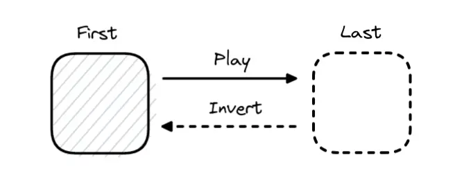
The FLIP animation technique is great when you have items that change position and want to show that transition and lets you do impossible CSS animations while being performant.
🐿️ The FLIP animation technique works by calculating the difference between the FIRST and LAST position of an element, INVERTING it to the original position and PLAYING it to the last position.
In the previous example if you remove an element it just leaves an empty space before it’s removed but it would be a lot nicer if the elements around it react and change their position which sounds complicated but it’s one line of code.
<script lang="ts">
  import { flip } from 'svelte/animate'
  // ...
</script>

<div class="container">
  {#if container === 1}
    {#each emojis as emoji (emoji)}
      <div
        class="emoji"
        animate:flip
        in:receive={{ key: emoji }}
        out:send={{ key: emoji }}
        on:click={() => remove(emoji)}
      >
        {emoji}
      </div>
    {/each}
  {/if}
</div>

<div class="container">
  {#if container === 2}
    {#each emojis as emoji (emoji)}
      <div
        class="emoji"
        animate:flip
        in:receive={{ key: emoji }}
        out:send={{ key: emoji }}
        on:click={() => remove(emoji)}
      >
        {emoji}
      </div>
    {/each}
  {/if}
</div>

<!-- ... -->
Having FLIP inside Svelte is amazing but it’s limited to an each block and later I’m going to show you an example of using FLIP with another animation library that’s going to blow your mind.
Motion
Svelte exposes two writable stores tweened and spring that are useful for values that change over time.
We take for granted how the browser can interpolate values of an element such as opacity going from 0 to 1 just by specifying a transition because the browser has to smoothly interpolate those values by creating intermediate values from 0.1 to 0.9.
Unfortunately you can’t tap into this power for values outside of CSS but lucky for us Svelte provides you with a way to interpolate between numbers, arrays and objects of the same shape.
You can pass options for delay, duration, easing and an interpolate function. The interpolate option lets you pass a (startingValue, targetValue) => time => result function, so you can use a package like d3-interpolate to smoothly interpolate between two colors among other things.
Use tweened when you need a smooth transition between two values.
In the next example I made a Pokémon game simulator where the Pokémon receives damage over time but I want to smoothly animate that change in value over time which only takes one line of code.
<script lang="ts">
  import { onMount } from 'svelte'
  import { tweened } from 'svelte/motion'

  let pokemon = {
    name: 'Pikachu',
    hp: 48,
    level: 20
  }

  // create tweened store
  let currentHp = tweened(pokemon.hp)

  let duration = 2000
  let interval: NodeJS.Timer

  function attack() {
    $currentHp -= 8
  }

  onMount(() => {
    interval = setInterval(attack, duration)
    return () => clearInterval(interval)
  })

  $: if ($currentHp < 0) {
    clearInterval(interval)
    $currentHp = pokemon.hp
    interval = setInterval(attack, duration)
  }
</script>

<div class="simulator">
  <h2>Pokémon Simulator</h2>

  <div class="stats">
    <div class="info">
      <span class="name">{pokemon.name}</span>
      <span class="level">Lv{pokemon.level}</span>
    </div>

    <div class="health">
      <div class="bar">
        <span>HP</span>
        <progress
          id="file"
          max={pokemon.hp}
          value={$currentHp}
          class:yellow={$currentHp <= 24}
          class:red={$currentHp < 16}
        />
      </div>
      <div class="values">
        {pokemon.hp} / {Math.trunc($currentHp)}
      </div>
    </div>
  </div>
</div>

<style lang="scss">
  .simulator {
    width: 100vw;
    height: 100vh;
    display: grid;
    place-content: center;
    font-family: 'Press Start 2P', cursive;
    background-image: linear-gradient(
        to bottom,
        hsl(0 0% 0% / 40%) 100%,
        transparent
      ),
      url('/images/background.webp');
    background-position: 50% 50%;
    background-repeat: no-repeat;
    background-size: cover;
  }

  h2 {
    text-align: center;
  }

  .stats {
    padding: 2rem;
    margin: 2rem 0;
    color: black;
    background-color: lightyellow;
    border: 4px solid black;
    border-top-left-radius: 1rem;
    border-bottom-right-radius: 1rem;
  }

  .info {
    display: flex;
    justify-content: space-between;

    .name {
      text-transform: uppercase;
    }
  }

  .health {
    .bar {
      width: min-content;
      display: flex;
      margin-top: 0.4rem;
      margin-left: auto;
      padding-left: 0.4rem;
      color: gold;
      background-color: darkslategray;
      border: 2px solid darkslategray;
      border-radius: 1rem;
      overflow: hidden;
    }

    .values {
      margin-top: 0.4rem;
      text-align: right;
    }
  }

  progress {
    appearance: none;
  }

  ::-webkit-progress-bar {
    background-color: darkslategray;
  }

  ::-webkit-progress-value {
    background-color: springgreen;
    border: 2px solid white;
    border-radius: 1rem;
    transition: background-color 0.3s ease;
  }

  .yellow::-webkit-progress-value {
    background-color: yellow;
  }

  .red::-webkit-progress-value {
    background-color: tomato;
  }
</style>
You can use spring to add more natural motion to your animations using spring based physics.
It’s similar to tweened but it generates the values based on its stiffness and damping parameters to give your animations a more natural springy feel.
You can’t use spring with Svelte transitions because springs don’t have a set duration but you can control:
stiffness(default0.15) gives more resistance for how tight the spring should bedamping(default0.8) for how springy it should beprecision(default0.01) threshold when the spring is considered settled
I have a simple box I want to animate using spring physics and I’m going to use Svelte actions which are just regular functions that gives us a reference to the element when it’s created because I want to be able to reuse the animation on other elements.
<script lang="ts">
  import { spring } from 'svelte/motion'
  import type { Action } from 'svelte/action'

  type SpringInParams = {
    scale: number
    rotate: number
  }
  type SpringInAction = Action<HTMLElement, SpringInParams>

  const springIn: SpringInAction = (node, params) => {
    if (!params) return

    const { scale, rotate } = params
    const value = { rotate: 0, scale: 1 }
    const options = { stiffness: 0.1, damping: 0.6 }

    // create spring store
    let transition = spring(value, options)

    // subscribe to store
    const unsubscribe = transition.subscribe(
      ({ rotate, scale }) => {
        node.style.transform = `scale(${scale}) rotate(${rotate}deg)`
      }
    )

    // store update starts animation
    // note: use transition.update(state => ...) if you need previous state
    transition.set(({ scale, rotate }))

    return {
      destroy: () => unsubscribe()
    }
  }
</script>

{#if animate}
  <div
    class="box"
    use:springIn={{ scale: 2, rotate: 90 }}
  />
{/if}

<style>
  .box {
    width: 140px;
    height: 140px;
    background-color: aquamarine;
    border-radius: 1rem;
    box-shadow: 0 0 10px hsl(0 0% 0% / 10%);
  }
</style>
Using Other Animation Libraries
Using Svelte is enough for most things but sometimes you need a specialist instead of a generalist and you can reach for animation libraries such as Anime.js, GSAP or Motion One that have features like timelines to coordinate animations.
So far you have seen what a powerful combination crossfade and flip make but they have their drawbacks like not working great on elements that are rotated and flip can’t be used outside an each block.
I’m working on a card game and want to animate placing cards from your hand to the deck and taking the card back from the deck but it’s not looking great because crossfade doesn’t consider the rotation.
There’s other problems when it comes to FLIP animations like nested transforms (rotations are evil okay) but GSAP provides a Flip plugin that takes care of everything for you.
<script lang="ts">
  import { gsap } from 'gsap'
  import Flip from 'gsap/dist/Flip'

  gsap.registerPlugin(Flip)

  type Card = {
    id: number
    content: string
    selected: boolean
  }

  let cards: Card[] = [
    { id: 1, content: '🎩', selected: false },
    { id: 2, content: '🪄', selected: false },
    { id: 3, content: '🐇', selected: false },
    { id: 4, content: '🌹', selected: false }
  ]

  $: stack = cards.filter((card) => card.selected)
  $: hand = cards.filter((card) => !card.selected)

  function flip() {
    const state = Flip.getState('.card')

    // you could also use tick
    requestAnimationFrame(() => {
      Flip.from(state, {
        targets: '.card',
        ease: 'power1.inOut'
      })
    })
  }

  function dealCard() {
    const emojis = ['🎩', '🪄', '🐇', '🌹']
    const index = Math.floor(Math.random() * emojis.length)

    cards = [
      ...cards,
      {
        id: cards.length + 1,
        content: emojis[index],
        selected: false
      }
    ]
  }

  function returnToStack(cardFromHand: Card) {
    const index = cards.findIndex(
      (card) => card === cardFromHand
    )
    cards[index].selected = true
    flip()
  }

  function returnToHand(cardFromDeck: Card) {
    const index = cards.findIndex(
      (card) => card === cardFromDeck
    )
    cards[index].selected = false
    flip()
  }
</script>

<svelte:window on:mousewheel={dealCard} />

<div class="table">
  <div class="deck">
    {#each stack as card, i}
      <div
        class="card"
        on:click={() => returnToHand(card)}
        data-flip-id={card.id}
        style:--index={i}
      >
        {card.content}
      </div>
    {/each}
  </div>

  <div class="hand" style:--cards={hand.length}>
    {#each hand as card, i}
      <div class="peek">
        <div
          class="card"
          on:click={() => returnToStack(card)}
          data-flip-id={card.id}
          style:--index={i}
        >
          {card.content}
        </div>
      </div>
    {/each}
  </div>
</div>

<style lang="scss">
  .deck {
    width: 220px;
    height: 300px;
    display: grid;
    position: absolute;
    left: 50%;
    top: 50%;
    padding: 0.3rem;
    transform: translate(-50%, -80%);
    background-color: hsl(220 20% 20%);
    border: 6px dashed hsl(220 20% 40%);
    border-radius: 1rem;

    > * {
      grid-area: 1 / -1;
    }

    .card {
      margin: 0;
      transform: rotate(calc(var(--index) * -2deg));
    }
  }

  .hand {
    --angle: 120;

    position: absolute;
    bottom: -20px;
    display: flex;
    justify-content: center;
  }

  .card {
    width: 200px;
    height: 280px;
    position: relative;
    display: grid;
    place-content: center;
    margin-left: -160px;
    z-index: calc(var(--cards) - var(--index));
    font-size: 4rem;
    color: hsl(220 20% 20%);
    background-color: hsl(220 20% 98%);
    box-shadow: 0 0 20px hsl(0 0% 0% / 20%);
    border-radius: 1rem;
    user-select: none;

    --previous: calc(
      var(--angle) / var(--cards) * (var(--index) + 1)
    );
    --next: calc(
      var(--angle) / 2 + (var(--angle) / var(--cards)) / 2
    );
    --rotation: calc(var(--previous) - var(--next));

    transform: rotate(calc(var(--rotation) * 1deg));
    transform-origin: bottom center;

    &:hover {
      cursor: pointer;
    }
  }

  .peek {
    transition: all 0.3s cubic-bezier(0, 0.44, 0.6, 1);
  }

  .peek:hover {
    z-index: 100;
    transform: translateY(-20px) scale(1.04);
  }
</style>
The best thing about Svelte is the ease of using existing JavaScript libraries because it doesn’t require special lifecycle methods to work and makes code reuse easy thanks to actions.
Remember the spring example from before? Here’s the same example using Motion One and Svelte actions.
import { animate, spring } from 'motion'
import type { Action } from 'svelte/action'

type SpringInParams = {
  scale: number
  rotate: number
}
type SpringInAction = Action<HTMLElement, SpringInParams>

export const springIn: SpringInAction = (node, params) => {
  if (!params) return

  animate(
    node,
    {
      scale: params.scale,
      rotate: params.rotate
    },
    {
      easing: spring()
    }
  )
}
You can import and use the action anywhere on any element.
<script lang="ts">
  import { springIn } from './animations'
</script>

<div
  class="box"
  use:springIn={{ scale: 2, rotate: 90 }}
/>

<style>
  .box {
    width: 140px;
    height: 140px;
    background-color: aquamarine;
    border-radius: 1rem;
    box-shadow: 0 0 10px hsl(0 0% 0% / 10%);
  }
</style>
Motion One also has Motion DevTools you can use to inspect and edit animations inside your browser.
Accessibility
If you’re using motion you have to be responsible because it can make someone sick and you have to respect their preference for prefers-reduced-motion.
That being said reduced motion doesn’t mean no motion! You just have to adjust the values to something more sensible for those users.
Here’s how you do it in CSS.
@media (prefers-reduced-motion) {
  /* adjust animation */
}
Here’s how you do it in JavaScript.
import { browser } from '$app/environment'

export function getPrefersReducedMotion() {
  if (!browser) return
  const query = '(prefers-reduced-motion: reduce)'
  const mediaQueryList = window.matchMedia(query)
  return mediaQueryList.matches
}<script lang="ts">
import { getPrefersReducedMotion } from './media'
const prefersReducedMotion = getPrefersReducedMotion()
// change animation value based on user preference
const value = prefersReducedMotion ? 'Yes' : 'No'
</script>
<h1>Prefers Reduced Motion: {value}</h1>If the user changes their preference it won’t update until they refresh the page but you can use a Svelte store to keep track of the changes and update the value.
Conclusion
You should be a proper Svelte animation wizard by now! 🧙
I hope you take what you learned and delight your users but remember that with great power comes great responsibility.
Consider accessibility from the start and remember animations done right are subtle but impactful.
Thank you for reading! 🏄️